Background
I am assisting a non-profit with a translation system that they use to translate documents into dozens of languages. The system presents a translator with a single sentence pair at a time. The top sentence is the source English sentence while the bottom sentence is a machine produced pre-translated sentence in the target language. See Figure 1.

This approach saves a lot of eye-wandering to keep finding the correct place in the text as a translator needs to jump back-and-forth between the original and translated text. It also focuses the translator’s attention on a single sentence at a time. Even so, a translator can simply hit the ‘+’ button to widen the context to as many sentences as needed.
The system breaks down a huge task into many small conquerable pieces (translation is a daunting task in general). By breaking the task down into sentence-sized pieces, it becomes less intimidating for a translator.
Having a pre-translated sentence saves a lot on typing and thinking time as all words/phrases are often present. The translator’s main effort goes into rearranging words/phrases and adding/removing a word here and there. If the translator prefers to translate in the traditional way, he/she can simply click/tap the ‘Clear’ button and translate the sentence from scratch.
The system also allows for multiple translators to proofread a document and ‘cast their votes’ or make additional changes. In the end, the system knows which rendition of a sentence has the top number of votes and automatically includes the top-voted edit (which will be highlighted) in the output document. See Figure 2.

If a translation engine for a specific language has not been trained yet, a translator can still get all the other benefits of the system by simply translating the presented English sentence from scratch, in other words without the benefit of a pre-translated sentence. In such cases the second sentence presented is just another copy of the English source sentence (which the translator clears and translates from scratch).
Pre-translations are generated by a neural machine translation algorithm. When a sufficient parallel corpus is available for a specific language an associated engine is created. The system also captures metrics on the performance of translators.
Visualization story
I am sometimes met with skepticism about the value of having a pre-translation presented to a translator. The argument is that translators are then required to first read the pre-translated sentence, wasting time and energy in the process. It will take less effort to just allow translators to translate each sentence from scratch. Word artists as they are, they would prefer this creative freedom anyway.
This sounds like a good argument. However, as outlined above, I maintain that providing a pre-translation has many benefits. From my point of view, providing a pre-translated sentence is the key feature of the system. It is therefore important for me to have convincing evidence for the value provided by this functionality. In short, my main idea is to convince the administrators at the non-profit that pre-translations add value to the efficiency of the translation process in general, and the performance of translators in particular. This situation defines the contextual awareness of my visualization story.
The independent variable in the story is the BLEU score of a document. It is a measure of the quality of a machine-translated document (as evaluated against a human-translated version). The human-translated version that will be used to determine the BLEU score of each pre-translation, is simply the finalized document delivered by a translator. BLEU scores range from 0 to 100, which represents a perfect translation.
The first dependent variable is the average number of seconds needed to translate a sentence, for each completed document. The other dependent variable is the percentage of sentences that needed to be changed during the translation of a document. These two variables function as performance metrics for the efficiency of the translation process. Understandably, this value varies widely due to a translator’s quality of work, level of dedication, brilliance, etc. Even so, my story will reveal that there is a gradual decline of mean time required per sentence as the BLEU score increases. It will also show that there is a progressive decline of percentage of sentences changed with increasing BLEU score.
The underlying rationale is therefore: The higher the BLEU score of a pre-translation, the less time a translator will spend on a sentence and the lower the percentage of changed sentences will be, for each document. I need to provide evidence of the correlation between providing a pre-translation (and the progressive increase in its quality, expressed as a BLEU score) and increased translator performance, expressed in the form of the dependent variables. This is supported by Tufte’s “Second principle for the analysis and presentation of data: Show causality, mechanism, explanation, systematic structure.” (Beautiful Evidence, E. R. Tufte, 2006).
The increase in the efficiency of the translation process in general, and translator performance in particular, leads to better productivity and reduced cost. Having pre-translations is therefore a valuable feature. My visualization story will be (in Berinato’s terms) data-driven and declarative (Good Charts - The HBR Guide to Making Smarter, More Persuasive Data Visualizations, Berinato, 2016).
Dataset
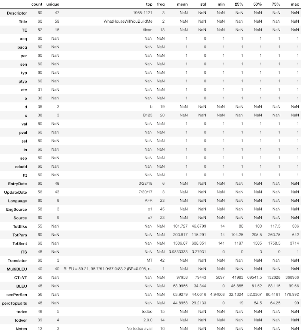
The dataset consists of 1935 records, each having 38 data fields. See Figure 3.
Source
The dataset belongs to the non-profit project known as “The Open Door” project. This is part of a larger missionary outreach initiative orchestrated by the client, a church in Canada. I am the custodian of the dataset and have permission to share it.
Row Subset
The subset of records that feature in my visualization story is a set of 60 records. Each of these records represent a translated document. This subset is called VisualizationProject.csv. From this subset, I had to throw out all records for which I did not have a BLEU score available. This left me with 48 records.
Column Subset
From the 38 columns in the data set I selected a subset of 11 features to use in my visualization story. See Figure 4.

Other preprocessing
Next, I sorted the dataset by the BLEU column. After this, I partitioned the 11 variables into categorical and continuous variables: * Categorical: * Descriptor, TE, Language, TotSent, ITS, Translator, todxx, todver * Continuous: * BLEU, secPerSen, percTopEdits
Final sub-selection of columns for my visualization story
After I finalized my visualization story, only the following columns remained: * BLEU (called quality of the pre-translation in the charts). This is the independent variable. * secPerSen (called seconds/sentence in the charts). This is the first dependent variable. * percTopEdits (called % sentences changed in the charts). % sentences changed is presented as (1 – percTopEdits) to increase understanding. This is the second dependent variable. * Translator (called pre-translation type in the charts). There are three pre-translation types: * No pre-translation * Machine pre-translation * Human pre-translation
A note on pre-translation type
To tell my visualization story, I need sufficient context. I need to be able to answer the question “Compared to what?” This is in line with Tufte’s “First principle for the analysis and presentation of data: Show comparisons, contrasts, differences.” (E. R. Tufte, Beautiful Evidence, 2006). In effect, I need to put a “frame” of reference around the data that showcase the correlation between the quality of the machine pre-translations and the dependent variables. On the low side, I found a handy reference: I assigned a BLEU score of zero to all documents who did not have any pre-translation. It is fair to assign a zero score for such documents because the BLEU algorithm would not find any similarities between the original English document and the final translated document. In other words, the BLEU algorithm would have come up with a value of zero or a value close to zero.
On the high side of the quality of pre-translations I was fortunate again to have some documents that had pre-translations that were provided by humans (rather than machines). It so happened that a handful of documents had to be finalized by another proofreading. For these, the initial (human) translation was presented as if it were a machine pre-translation. Understandably, these pre-translations were of higher quality as they were deemed as final translations by the humans who translated them in the first place.
Tools
I used python and a Jupyter notebook (called VisualizationProject.ipynb) to prepare the visualizations. In addition, I used the following python libraries: * Fast.ai * Matplotlib * Seaborn
The dataset ingested by the Jupyter notebook is called VisualizationProject.csv.
The notebook containing the complete development of the visualizations may be accessed here:
Principles used to design the visualizations
I made use of some general principles throughout the design of the visualizations.
Layering and separation
Tufte makes the point:
“Among the most powerful devices for reducing noise and enriching the content of displays is the technique of layering and separation, visually stratifying various aspects of the data.” And again: “What matters — inevitably, unrelentingly — is the proper relationship among information layers.” (E. R. Tufte, Envisioning Information, 1990, p. 53).
Valuing this advice, I ensured that the trend lines are on a higher or more prominent visual layer by making them more saturated and more intense. Sometimes I used color as well. The datapoints were made less saturated and intense, in effect placing them on the neutral “bottom” visual layer. The structural elements of the charts (axes, axes labels, and tick labels) were also demoted to the neutral layer.
Reduce chart junk and erase non-data-ink
I tried to reduce chart junk and maximize data-ink ratio as much as possible by: * Removing all grid lines (the visualization story is not about the accurate location of values but rather about the trends). * Removing all tick marks, for the same reason. * Keeping x and y axes only on one side of the chart and using a neutral color (grey). There is no traditional frame around the chart. * Not stating axes labels in the heading/sub-heading.
Color
- I used color sparingly. “Minimize the number of colors you use.” (Berinato)
- I generally used grey for the datapoints and structure elements, with a white background (Third rule of color in Tufte, Envisioning Information, 1990, p. 90).
- Where I do use color for datapoints (iterations 4, 5), I applied the fourth rule from Tufte, Envisioning Information, 1990, p. 90: “All colors of the main theme should be scattered like islands in the background color.”
Other best practices
- Simplicity. As Tufte puts it: “Graphical elegance is often found in simplicity of design and complexity of data.” (E. R. Tufte, The Visual Display of Quantitative Information, 2001, p. 177).
- Integrity guidelines (number representation proportional to numerical quantities, clear labeling, no design variation, dimensions on graphic should not exceed dimensions in data, graphics do not quote data out of context).
- Berinato’s four parts of a chart: Title, subtitle, visual field, source line.
- Multiple variables. I used at least three variables throughout. “Graphical excellence is nearly always multivariate.” (E. R. Tufte, The Visual Display of Quantitative Information, 2001, p. 51).
- “The Friendly Data Graphic” (E. R. Tufte, The Visual Display of Quantitative Information, 2001, p. 183).
- Words are spelled out (rather than abbreviations). I wanted to have the x-axis label “BLEU score” but decided instead that “Quality of pre-translation” would suffice and be more understandable.
- Words run from left to right (rather than vertically). I have all y-axis labels in horizontal format.
- Labels are placed on the graphic itself (rather than a legend). I have no legends.
- Cater for color-blindness. All graphics have support for color-blindness.
- Type is upper-and-lower case (rather than all capitals).
- “The principles for the analysis and presentation of data” (E. R. Tufte, Beautiful Evidence, 2006, p. 122).
- Show comparisons, contrasts, differences. In my final iteration, I show how seconds/sentence and % sentences changed varies with the quality of the pre-translation, compared among the cases No pre-translation, Machine pre-translation, and Human pre-translation.
- Causality, Mechanism, Structure, Explanation. The trend lines (obtained by linear regression) in my visualizations clearly explain the mechanism and structure to achieve better translator performance: Increase the quality of the pre-translation. Increased translator performance is caused by improving the quality of the pre-translation. They answer the question posed in the title: “Does it help to give translators a pre-translation?” The answer is clearly, “Yes, it does.”
- Show multivariate data. All the visualizations show multivariate data.
- Completely integrate words, numbers, images, diagrams. My graphics show labels next to the markers within the diagrams.
- Thoroughly describe the evidence. This document fulfills this requirement. I also included my name and the date on each visualization.
Iterations
I had to go through five iterations before arriving at my final visualization.
Iteration 1: Bubble chart scatter plot
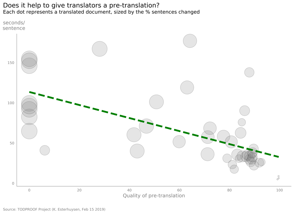
According to Lane Harrison (and others) a scatter chart is the most effective chart type to show correlation (Good Charts - The HBR Guide to Making Smarter, More Persuasive Data Visualizations, Berinato, 2016). Please see Figure 5.
Pros
- Easy to understand, low clutter.
- Shows clear trend (intense green trend line color over neutral markers, green may also suggest “goodness” to some viewers which is part of the message). Exclude linear regression line’s parameters for the sake of simplicity.
- Multivariate (3 variables).
- Markers are, what Tufte calls, multifunctioning graphical elements (E. R. Tufte, The Visual Display of Quantitative Information, 2001, p. 139). Each marker indicates 3 quantities.
- Low opacity allows good representation of the density of data points.
- Darker marker edges make it easy to detect smaller markers (bottom right).
- Color palette allows for easy rendition on the printed page. Color palette is sensitive to color blindness (red/green not used together).
Cons
- % sentences changed is a 1-D quantity, but it is expressed by a 2-D circle area which is not ideal. In addition, the visual response to increases in circle size is not linear (Steven’s law).
- Large variation in marker size may allow the small markers (bottom right) to go unnoticed.
- Although simpler, this visualization does not use all the variables.
Iteration 2: Two kernel density plots
Figure 6 shows a chart consisting of two kernel density plots.
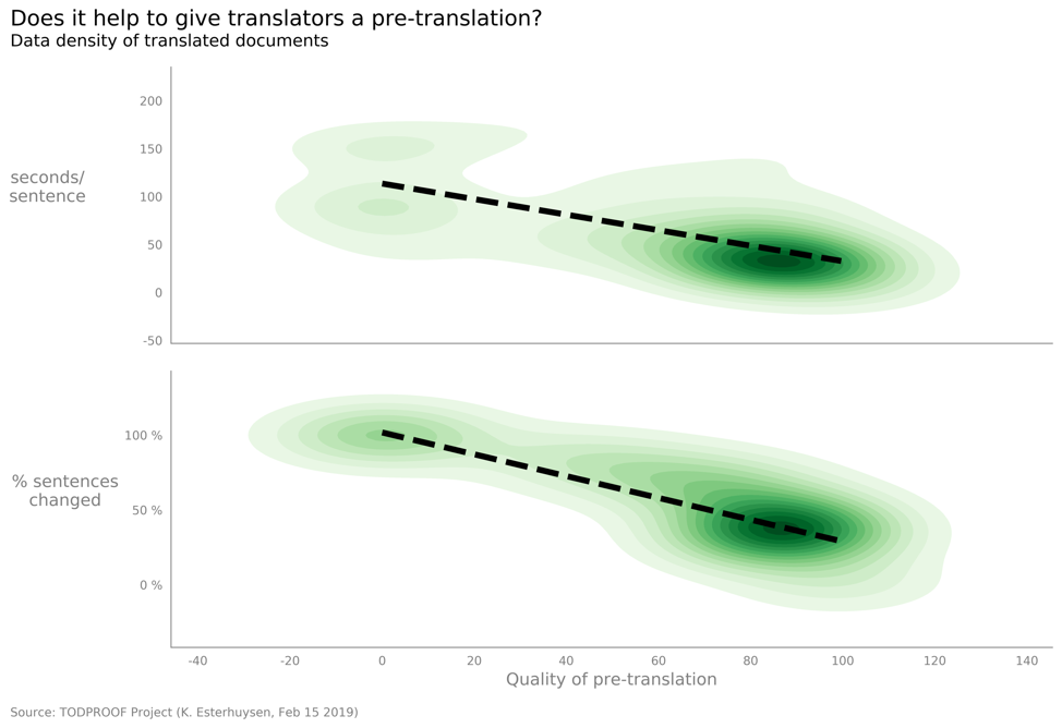
- As pointed out by Berinato, the use of two y-axes on the same chart is not a good practice. Instead, I made separate charts – one for each dependent variable.
- I placed the charts below each other, rather than next to each other. This aligns with the principle that it is usually better to have the x-axis longer than the y-axis. (This is pointed out by Tufte when he compares it to what was called the golden rule during the middle-ages.) Berinato also makes a point of this and even suggests that it could be considered unethical to compress the x-axis too much to enhance a specific story.
- I decided to append the %-sign after each y-axis tick label to discourage a possible tendency to want to equate/compare the two vertical axes.
- I chose to not use blue as it may suggest the conventional “deepness” at the highest density points. Using red might have suggested “hotness” at these points, maybe not appropriate for my purpose either. Green looks pleasing and may suggest “goodness” to some viewers which is part of the message – the goodness of the falling trend.
- I made both charts the same color to minimize the number of colors used and to reduce cognitive burden.
- I restricted the number of density levels to 15 to reduce moiré vibration along the higher contour lines.
Pros
- Shows clear trends. Exclude linear regression line’s parameters for the sake of simplicity.
- Might be more informative to technical viewers.
- Multivariate (3 variables).
- Color palette is sensitive to color blindness (red/green not used together).
Cons
- Harder to understand for the average viewer due to the statistical principle of density of a distribution.
- Subtitle might not make sense to many readers.
- This kind of chart is ideal for larger datasets (my dataset is relatively small with 48 observations).
- Does not use all the variables.
- Not enough visual separation between trend lines and the data representation, especially at the highest density points.
- Some moiré vibration remains at the higher contour lines.
- Black color of trend lines converges with black coloration of highest density points introducing unnecessary weight (I could have used red but that would have introduced a color-blindness situation).
- Chart can benefit from what Tufte calls “subtraction of weight.”
- Edge fluting occurs between adjacent contours which is somewhat distracting.
Iteration 3: Two scatter plots
Figure 7 shows a chart consisting of two scatter plots.
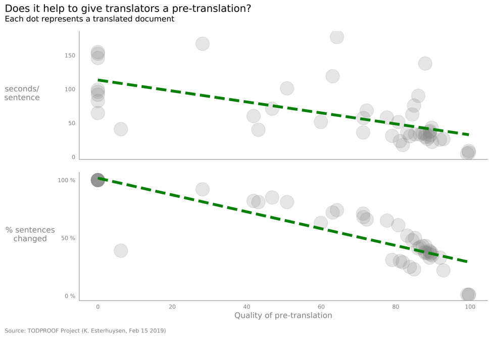
- I picked the scatter plots over the density plots as a result of their relative advantages. Most viewers will find the scatter plots easier to understand.
- I again used two charts rather than two y-axes on the same chart for the reasons pointed out above.
- Again, I appended the %-sign after each y-axis tick label to discourage a possible tendency to want to equate/compare the two vertical axes.
Pros
- Easy to understand scatter plots.
- Shows clear trends (intense green trend line color over neutral markers, green may also suggest “goodness” to some viewers which is part of the message). Exclude linear regression line’s parameters for the sake of simplicity.
- Multivariate (3 variables).
- Low opacity allows good representation of the density of data points.
- Color palette allows for easy rendition on the printed page.
- Color palette is sensitive to color blindness (red/green not used together).
Cons
- Although simpler, does not use all the variables.
- Overlapping markers’ darker color competes with trend lines.
- Maybe marker size is too large?
Iteration 4: Two scatter plots with a fourth variable
Figure 8 shows a chart consisting of two scatter plots and a fourth variable.
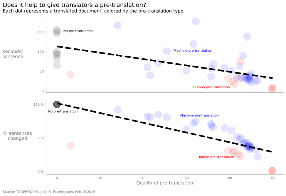
- Introduce 4th variable (pre-translation type) by coloration of markers. This means I will use the gestalt law of similarity to group translations by means of the similarity of their associated pre-translations. Using more variables is encouraged by Tufte’s “Third principle for the analysis and presentation of data: Show multivariate data.” (Beautiful Evidence, E. R. Tufte, 2006).
- Place comments/data labels close to markers instead of using a legend. This is suggested by Tufte’s “Fourth principle for the analysis and presentation of data: Completely integrate words, numbers, images, diagrams. (Beautiful Evidence, E. R. Tufte, 2006).
- Make opacity even lower to reduce the distracting effect of overlapping markers.
- Make marker size slightly smaller to reduce overlapping. Marker sizes cannot be too small, else color differences become harder to detect.
- Change color of trend line from green to black (green and red should not be used together for color-blindness problems).
Pros
- Easy to understand scatter plots.
- Shows clear trends (intense trend line color over lighter markers; further decrease in opacity). Exclude linear regression line’s parameters for the sake of simplicity.
- Multivariate (now 4 variables) – one more variable, i.e. using all the relevant variables.
- Low opacity allows good representation of the density of data points.
- Color palette is sensitive to color blindness (red/green not used together).
- Provides good context, answers the question “Compared to what?”.
- Data labels close to markers (no legend). I considered spreading the labels over both graphics suggesting that they apply everywhere allowing me to only present them once. After trying this it seemed that it may cause confusion, so I added the three pre-translation type labels in each scatter plot.
Cons
- The use of colors maybe somewhat confusing, even though I have lowered the opacity. The varying overlaps between transparent markers lead to many shades of color. As Berinato says: “The more color differences they see, the more they have to work to figure out what the distinctions represent.”
Iteration 5: Two scatter plots with a fourth variable and better coloration
Figure 9 shows a chart consisting of two scatter plots, a fourth variable and better coloration of the pre-translation types.
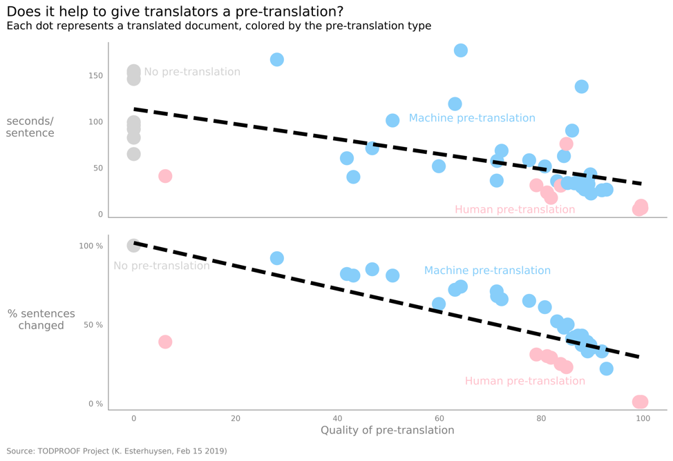
- Make marker colors fully opaque. Now we don’t get the many shades due to overlapping of transparent markers, reducing the confusion.
- Make marker size even smaller to compensate for the increase in color intensity in order to maintain a proper weight balance between the trend line and the markers. Marker sizes cannot be too small, else color differences become harder to detect.
Pros
- Easy to understand scatter plots.
- Shows clear trends (intense trend line color over lighter, less saturated markers and their labels). Exclude linear regression line’s parameters for the sake of simplicity.
- Multivariate (4 variables), using all the relevant variables.
- Color palette is sensitive to color blindness (red/green not used together).
- Provides good context, answers question “Compared to what?”
- Data labels close to markers (no legend).
- Good balance between trend lines and markers.
Cons
- Density of data points is indicated less effectively. For example, it is not possible to show that all the no pre-translation markers overlap (top left of bottom chart). Even so, this is my final choice for the visualization story.
REFERENCES
Berinato, S. (2016). Good Charts - The HBR Guide to Making Smarter, More Persuasive Data Visualizations.
Tufte, E. R. (1990). Envisioning Information.
Tufte, E. R. (2001). The Visual Display of Quantitative Information.
Tufte, E. R. (2006). Beautiful Evidence.
