This project suggests an automatic way for post-flight analysts to undertake classification of flight profiles into useful versus non-useful classes. Instead of using the traditional algorithms for time-series classification, this work makes use of a relatively new approach: Before classifying, first transform a time-series into an image. This allows for the application of a well-developed set of algorithms from the area of computer vision. In this project, we perform a comparison of a number of these transformation techniques in terms of their associated image classification performance. We apply each transformation technique to the time-series dataset in turn, train a Convolutional Neural Network to do classification, and record the performance. Then we select the most performant transformation technique (a simple line plot that got a 100% F1-score) and use it in the rest of the analysis pipeline.
The pipeline consists of three models. The first model classifies flight profiles into developed (useful) and non-developed (non-useful) profiles. The second model performs multi-label classification on the developed profiles from the first model. The labels reflect whether a profile has canonical climb/cruise/descent segments. The last model classifies flight profiles with canonical cruise segments into classes that have extended cruises (useful) and shorter cruises (non-useful).
Next, we prepare a significant unlabeled test dataset, consisting of data points that have never been seen by any of the models. We construct an end-to-end analytic inference process to simulate a production system, apply it to the test dataset, and obtain impressive results. Finally, we make recommendations to post-flight and other interested analysts.
Keywords: Deep learning, Time series, Image Classification, CNN, RNN, Flight path
1 BACKGROUND
One of the important operational characteristics of a commercial airliner is its flight path. This term needs qualification though. The lateral flight path is the track projected onto a flat earth from above. To visualize the lateral flight path one can plot longitude versus latitude as flight time progresses. The vertical flight path, on the other hand, is the altitude profile (viewed from the side). This may be visualized by plotting altitude versus flight time. This project will focus on the vertical flight path. When we use the term flight path or flight profile in the rest of the document, we will always refer to the vertical flight path.
During normal operation, an airliner has a predictable flight path. After takeoff, it climbs as quickly as possible (during the phase known as climb) until it reaches a point called the top of climb. The pilot then levels off and usually maintains this altitude for most of the flight (straight-and-level flight). This phase of the flight is known as cruise. When nearing its destination, a point is reached that is known as top of descent. At this point the pilot enters the descent phase. Finally, the flight ends during the landing of the aircraft.
Post-flight data analysts are often interested in separating useful from non-useful (or less useful) flight paths prior to a specific analysis. In this document, and its associated analysis code, useful profiles will be labeled as typical (abbreviated as “typ”) while less useful, non-useful, or anomalous flight paths (for a specific analysis) will be labeled as non-typical (abbreviated as “non”). A typical flight profile, in the context of this document, has a relatively extended cruise section without changes in altitude (see Figure 1.1). This characteristic will make it useful for certain types of analyses, for example, to estimate hard-to-measure variables like drag and exact angle-of-attack, as well as estimations of the positions of vertical flight control surfaces (even though they are measured). Flight paths could also be considered non-typical due to insignificant (i.e. too short) cruise segments and missing data (see Figure 1.2). Note that our definition of usefulness is by no means universal in post-flight analysis.
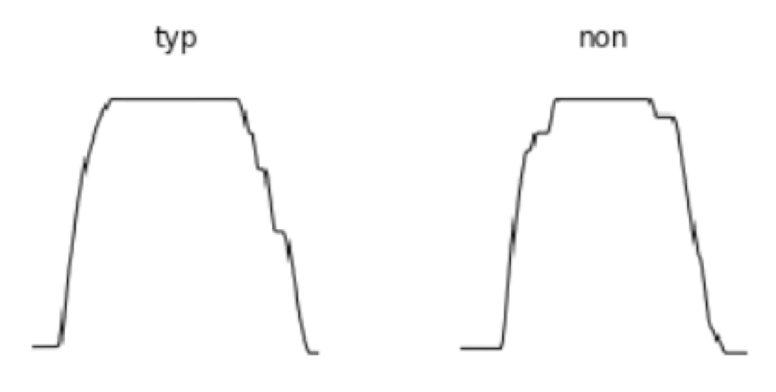
A large airline can operate thousands of flights a day and it is not feasible for the analyst to do this separation/classification in a manual way. What comes to mind next is to construct an algorithm to take on the task. However, it is not straightforward to come up with a traditional algorithm that would discriminate between typical and non-typical flight paths. A promising approach, of course, is to use supervised machine learning and show the model a large enough number of training examples.
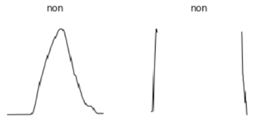
The predictor points for this problem are not structured vectors as is common in the case of structured data analysis. Here we have to use a time-series or sequence of scalar-valued predictor points and have the model learn the associated target point which is a single categorical “scalar” in each case. The values of the target points will be either typical (“typ”) or non-typical (“non”). We therefore have a classification problem: Given a flight path (as a scalar-valued time-series), the classifier should choose between typical and non-typical (scalar-valued and categorical).
In the deep learning subfield, it is common to use a Recurrent Neural Network (RNN) for this kind of problem. See, for example, Hüsken and Stagge (2003), and also Sun, Di, and Fang (2019). However, the training of an RNN can be challenging due to high demands on computing resources including processing power, processing time, and memory. There is also the vanishing/exploding gradients problem, addressed in various ways, but is often still lurking in the background.
Consider how easy it is for the human visual system to handle this problem, and in a fraction of a second. In fact, this is exactly how analysts often do their classifications manually. This suggests that we might benefit from tapping into the biological mechanisms for analyzing visual data (i.e. images). Recently, some researchers started adopting this insight. See, for example, Wang and Oates (2015a). The essence of this line of thought is the following: Instead of analyzing a sequence of 1-D or scalar-valued temporal data points, we transform them into a single 2-D or matrix-valued spatial data point. The spatial data point is simply an image which means the time-series signal has been transformed into an image (see Figure 1.3 for an example of a transformation technique). This allows for the application of a large body of relatively well-developed computer vision techniques to the above-stated problem. Most of these techniques center around the Convolutional Neural Network (CNN). In summary, the time-series classification problem has been converted to an image classification problem.
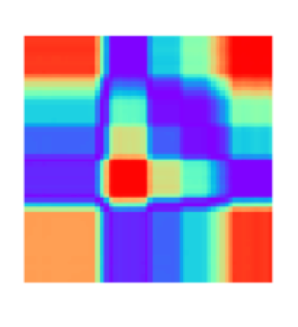
This comparative case study will not attempt to compare the difference between using RNNs and CNNs to solve the flight path classification problem. Instead, it will compare the impact of a number of transformation techniques (to transform the time-series into an image) on the image classification performance. After application of each transformation technique to the training dataset of flight path time-series, a CNN will be trained which will serve as a classifier. The performance of the classifiers will be compared. Transfer learning will be used to speed up the training of the CNNs.
1.1 VALUE PROPOSITION
This project seeks to provide value in a number of ways: * Demonstrates how flight profile time-series can be turned into images for more effective classification * Identifies the best transformation technique for flight path time-series * Reduces the need for (or does away with) hand classification of flight profiles. This will save significant amounts of time for post-flight analysts. * Provides an analytic process that can be adopted as a tool by analysts. They can then implement the analytical process in their own preferred technology environment. * Demonstrates how transfer learning greatly speedup the time to train a CNN neural network for the classification of profiles. This should encourage analysts that might still be skeptical about the use of deep learning for everyday tasks, and save them even more time. * Demonstrates how post-flight analysis can be undertaken by ordinary analysts. This data is usually considered sensitive by airlines and are not published. A publicly available de-identified source of flight data is used and the project demonstrates how this provides a valuable opportunity for analysts. * Encourages data scientists to undertake post-flight analyses. This is especially needed in the area of airline safety. In addition, and when allowed by airline policies and pilot unions, post-flight analysis can be a valuable tool in the performance evaluation of pilots. This can have a positive impact on the profitability of an airline. * Satisfies my personal interest in the analysis of flight data as well as the application of cutting edge analysis techniques in the form of deep learning.
1.2 OBJECTIVES
To setup an analytics pipeline for analysts, the foremost objective is to find the best transformation technique to convert flight path time-series into images. The rest of the objectives provide the components for the construction of the pipeline.
1.2.1 Transformation Techniques
We will perform a comparison of a number of transformation techniques in terms of their associated image classification performance. To do this we will apply each transformation technique to the cleaned time-series dataset in turn, train a CNN to do classification (using supervised learning), and record the performance. Then we will select the most performant transformation technique and use this technique in the rest of the analysis pipeline. The following transformation techniques will be considered: * Altitude line plots transformed into an image * Altitude area plots transformed into an image * Gramian Angular Summation Field (GASF) * Gramian Angular Difference Field (GADF) * Markov Transition Field (MTF) * Recurrence Plot (RP)
1.2.2 Developed/Non-developed Model
The first model in the analytics pipeline will classify flight profiles into developed (useful) and non-developed (non-useful) profiles. We will also consider the use of anomaly detection by means of an auto-encoder (instead of a classification algorithm) due to a significant class imbalance.
1.2.3 Canonical Segments Model
The next model in the pipeline will perform multi-label classification of the developed profiles. The labels used here will reflect whether a profile has canonical climb, cruise, and descent segments. In this context, canonical means relatively smooth.
1.2.4 Extended/Short Cruises Model
The final model in the pipeline will classify flight profiles with canonical cruise segments (regardless of the properties of climb or descent segments) into profiles that have extended cruises (useful) and shorter cruises (non-useful).
1.2.3 End-to-end Inference
The final objective will be to prepare a significant test dataset, consisting of data points that have never been seen by any of the models. We will construct an end-to-end inference process to simulate a production system and apply it to the test dataset. Then we will make recommendations to post-flight analysts.
2 DATA SOURCE
At any moment, there is an average of about 10,000 airplanes in the sky carrying more than a million passengers. Hundreds of variables are usually monitored during a flight which often has a duration of a number of hours. Many of these variables are sampled at a rate of once per second or more frequently. A huge volume of data is generated during a typical flight. This suggests that the analysis of flight data should be of some importance. Moreover, it seems reasonable that flight data should be easily accessible. This is not always the case, however.
Flight data directly reveals how an airline operates its core business and how efficiently pilots perform their duties. This data is considered sensitive. Some of the collected flight data, however, is so basic that it is, in fact, publicly available. Examples are datapoints that contain altitude, latitude, longitude, and heading. This information is considered to be public in the interest of the safe operation of all aircraft.
2.1 SOURCES OF FLIGHT DATA
The gradual adoption of Automatic Dependent Surveillance – Broadcast (ADS–B) by airlines is leading to the wide availability of flight data in the public domain. Wikipedia gives a good overview of this technology (“Automatic dependent surveillance – broadcast,” n.d.). The ADS-B technology allows an aircraft to use satellite navigation to find its position. It then broadcasts this information periodically which enables ground stations to track it. This method is used as a replacement for secondary surveillance radar (SSR) and does not depend on an interrogation signal from the ground. The data that is broadcast can also update the situational awareness of other aircraft in the area.
2.1.1 Publicly available flight data
The increasing use of ADS-B has led to many flight tracking sites that publish basic flight data for consumption by the public. See “This Is How Flight Tracking Sites Work” (Rabinowitz, 2017). This data is relatively superficial and usually consists of a dozen or so measured quantities. Some of the more prominent players are: * ADS-B Exchange at https://www.adsbexchange.com/
* OPENSKY at https://opensky-network.org/ * FlightAware at https://flightaware.com/ * ADSBHub at http://www.adsbhub.org/ * planefinder at https://planefinder.net/ * Aireon at https://aireon.com/ * flightradar24 at https://www.flightradar24.com/ * RadarBox at https://www.radarbox24.com/
Even though these sources provide the altitude data needed for the analyses described in this document, we chose to not use any of them. Follow-up analyses often require more in-depth flight data that is not provided by any of the ADS-B sources. We also want to provide an example of how to use a substantial flight data source consisting of in-depth data.
2.1.2 In-depth flight data
Detailed, in-depth flight data is generally unavailable to the public. There are a few sources that make de-indentified data available but usefulness varies. A few sources are: * DASHlink at https://c3.nasa.gov/dashlink/ * IATA at https://www.iata.org/services/statistics/gadm/Pages/fdx.aspx * Data.gov at https://www.data.gov/ with a search term of “ads-b”
2.1.3 Selected data source
We selected the DASHlink source. The data is accessible from https://c3.nasa.gov/dashlink/projects/85/. After clicking on “35 Datasets,” we used the data for “Tail 687.” This is a large amount of data (2,395.4 MB in zipped format) from which we sub-selected the first three datasets: Tail_687_1.zip, Tail_687_2.zip, and Tail_687_3.zip. The data can be downloaded from Sample Flight Data. There are 186 measured quantities (features) in the data.
3 DATA PREPARATION
The preparation of data involves conversion, cleaning, resampling, and the transformation of time-series data to images.
3.1 EXPLORATION OF DATA STRUCTURE
The structure of the raw data files is somewhat complicated. It is in MATLAB format and different variables were sampled at different sample rates. For familiarization, a thorough exploration of the structure of the raw data is provided in the notebook:
The actual preparation of the data was divided into two procedures. This first takes care of general conversion and cleaning tasks. The second undertakes the transformation of the time-series in each file to its associated spatial signal or image. Each procedure occurs in its own notebook.
3.2 CLEANING PREPARATION PROCEDURE
The source data is in MATLAB format (.mat) after downloading and unzipping. The raw data acquired for this project were as follows: * For training, including validation (data will be labeled) * Tail_687_1.zip (651 flights) * Tail_687_2.zip (602 flights) * For testing, i.e. simulation of production (data will not be labeled) * Tail_687_3.zip (582 flights)
After downloading and unzipping, the files in each folder were converted separately (from .mat to .csv) by means of the notebook:
The output .csv files were eventually moved to either the Train (1,253 files) or Test (582 files) folders.
The cleaning preparation procedure can be summarized as follows: * Conversion: * Using the scipy.io Python package, the data is converted from MATLAB format to a simple .csv format. * Make a dataframe for each sample rate: * All datapoints for a specific sample rate are collected in a dataframe. The rates available are referred to as 0.25, 1, 2, 4, 8, and 16. * All dataframes are combined into a single dataframe. * Remove invalid time values: * Files with invalid values for year, month, day, hour, minute, or second are removed in this step. * Output a csv file from the dataframe * Build date-time index * Being a time-series, it is important to index the data in the form of a date-time index. This is done by reading the exported file back into a dataframe. * Down-sample to 1 minute rate: * The data in each file’s dataframe is down-sampled from a variable’s specific sample rate to a 1 minute rate. This reduces the intensity of the data as well as provides for a more realistic sample rate for the purposes of this study. * Another csv file is exported using the same name but having a “-1min” appended to the name.
3.3 TRANFORMATION PREPARATION PROCEDURE
The transformation procedure occurs in the notebook:
The transformation preparation procedure can be summarized as follows: * Read the csv data into a dataframe * Select the transformation technique * Done by commenting in the appropriate section of code. Please see section 4.1.3 for a description of each transformation technique. * Plot the time-series signal * To convert the time-series signal to a spatial signal it is plotted as a graphic. * The graphic is stripped of all annotations, e.g. the frame, tick marks, tick labels, axis labels, and heading. * Save the image, using the same name but having an extension of .png.
4 MODELING
In this section, we will look at the important concept of time-series classification and how it relates to two of the most important deep learning architectures: Recurrent Neural Networks (RNNs) and Convolutional Neural Networks (CNNs). Then we will discuss the classification models for our pipeline in detail, making use of image-transformed flight profile time-series and the CNN architecture.
4.1 TIME-SERIES CLASSIFICATION
Time-series classification (TSC) is an area of active research. Some consider it one of the most challenging problems in data mining (Esling & Agon, 2012). This opinion is supported by Yang and Wu (2006). A large number of techniques have been invented. Many of these approaches are covered by Bagnall, Lines, Bostrom, Large, and Keogh (2017). The most promising approach, they point out, is known as COTE (Collective Of Transformation-based Ensembles) as described by Bagnall, Lines, Hills, and Bostrom (2016). HIVE-COTE is an extension of COTE (Lines, Taylor, & Bagnall, 2016). See also Lines, Taylor, and Bagnall (2018). The extension is in the form of a Hierarchical Vote system. This is considered the state-of-the-art currently. To use HIVE-COTE a large number of classifiers (37) need to be trained. The decisions made by them are not easy to interpret and classification time is excessive.
Given the impressive successes of deep learning in many disciplines lately, the use of it has started to make inroads into the area of time-series classification (Wang, Yan, & Oates, 2017). In their recent paper, “Deep Learning for Time Series Classification: A Review,” Fawaz, Forestier, Weber, Idoumghar, and Muller (2019) point out that they achieved results that are not significantly different from results obtained from HIVE-COTE by making use of deep learning and a residual network. They also provide a handy taxonomy (p. 11) for the use of deep learning algorithms to classify time-series (somewhat abbreviated here): * Deep Learning for Time Series Classification * Generative Models * Auto Encoders * RNNs * Echo State Networks (simplified RNNs) * Discriminative Models * Feature Engineering * Image Transformation * Domain Specific * End-to-End * Multi-Layer Perceptrons (aka fully-connected or FC networks) * CNNs * Hybrid
The main division is between generative and discriminative models. Generative models generally include an unsupervised training step before the learner fits its classifier. A discriminative model, on the other hand, directly fits the mapping from the raw input of a time-series to the probability distribution over the classification classes.
The literature informally agree that discriminative models are more accurate than generative models. In this report, we will focus on the Image Transformation leaf of this tree, which falls under discriminative models.
There are significant advantages in the use of deep learning to classify time-series. One specific advantage is the ability to detect time invariant characteristics. This is similar to how spatially invariant filters detect patterns in images.
4.1.1 Recurrent Neural Networks (RNNs)
In a fairly old paper, Hüsken and Stagge (2003) promote the use of RNNs for time-series classification. Recurrent layers are described by the equations:
\[ \Large \begin{align} \mathbf{a}^{<t>} &= g(\mathbf{W}_{aa} \mathbf{a}^{<t-1>} + \mathbf{W}_{ax} \mathbf{x}^{<t>} + \mathbf{b}_a) \\ \hat{\mathbf{y}}^{<t>} &= g(\mathbf W_{ya}\mathbf{a}^{<t>} + \mathbf{b_y}) \end{align} \]
The parameters or weights that undergo training are captured in a number of filters or kernels. The feedback filter is \(\mathbf{W}_{aa}\), the input filter \(\mathbf{W}_{ax}\), and the output filter \(\mathbf{W}_{ya}\). The signal is the data that are used as examples during training. The symbols \(\mathbf{x}^{<t>}\) and \(\mathbf{\hat{y}}^{<t>}\) represent the input and output signals respectively. The hidden state, or internal signal, is given by \(\mathbf{a}^{<t>}\). The filters are matrices while the signals are vector-valued. There is often a single layer in an RNN. Note, however, that this architecture is recursive. This means that each time-step could be considered a separate layer in time.
In the context of our classification problem, the input is a sequence of scalar-valued continuous predictor points. The output is a single scalar-valued categorical target point (after being processed by a sigmoid function). The values of a target point are the classes, either typ or non. This type of RNN is also known as a many-to-one RNN because a series of input data points leads to a single output datapoint.
4.1.2 Disadvantages of RNNs
In 2015 RNNs made a dramatic come-back (Karpathy, 2015). A year or two after this the ResNet (He, Zhang, Ren & Sun, 2016) and the attention mechanism (Xu et al., 2015) were invented. This provided an expanded context for the evaluation of RNNs and the Long Short Term Memory (LSTM). A further two years later saw the beginning of the decline of the popularity of the RNN and the LSTM in some disciplines.
Culurciell (2018) points out some shortcomings of RNNs in his article “The fall of RNN / LSTM.” In this regard, he mentions the problem of vanishing gradients and that RNNs are not hardware friendly. Fawaz et al. (2019) mostly agree with these sentiments and also mention that an RNN’s architecture was designed for the prediction of the next element in a sequence, not necessarily ideal for the classification task. RNNs are also harder to train and parallelize.
4.1.3 Time-series transformation to images
Before we look at Convolutional Neural Networks (CNNs), we will discuss how a time-series can be transformed into an image. The purpose of this transformation is to enable computers to “visually” recognize and classify the time-series signal. By doing this transformation we can take advantage of the impressive successes of deep learning architectures (using CNNs) in computer vision. This allows us to identify the structure of a time-series, leading to more effective classification.
We will start by plotting the altitude time-series of a flight. This will be the first (and most simple) transformation. Then we make the image slightly richer by filling the area under the curve. After this, a number of more sophisticated transformation techniques will be used to transform the same time-series into the following representations: Gramian angular summation field, Gramian angular difference field, Markov transition field, and a recurrence plot.
4.1.3.1 Altitude line plots transformed into an image
To create this spatial (or image) representation of the time-series, we will use a dark pen on a light background. This black-and-white rendition was deliberately prevented from being binary. A binary image only needs one channel. The pixel values of such an image only have one of two values. To make fair comparisons with more complex renditions (that use coloration), this image was allowed to have three channels as well. This manifests in the form of some blurriness along the black lines which come from the presence of grey pixels.
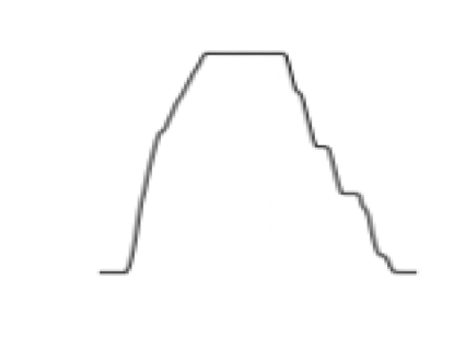
No graphical annotations will be included, i.e. graphic frame, tick marks, tick labels, axis labels, and heading. Annotations will make the learning process unnecessarily complex. Figure 4.1 shows an example.
4.1.3.2 Altitude area plots transformed into an image
To create the area transformation, we use a color (magenta) that is not confined to a single channel in the red-green-blue (RGB) encoding. There is also an outline in a slightly darker tint. Figure 4.2 shows the rendition of the same time-series.

4.1.3.3 Gramian Angular Field (GAF)
The use of Gramian Angular Fields is described in Wang and Oates (2015a, 2015b, 2015c). Having a data point represented as either a time-series or an image is referred to by them as the duality between time-series and images. We will first develop the theory of the more generic Gramian Angular Field before we distinguish between the summation (GASF) and difference (GADF) fields.
Consider a time series \(X=\{x^{<1>}, x^{<2>}, ..., x^{<m>}\}\) of \(m\) scalar-valued and real datapoints. Being a time-series the order of the datapoints is important. The index in angle brackets indicate this order. Next, we scale \(X\) so that all values are in the interval [-1, 1]:
\[ \Large \begin{align} \tilde{x}^{<i>} = \frac{(x^{<i>} - \text{max}(X)) + (x^{<i>} - \text{min}(X))}{\text{max}(X)-\text{min}(X)} \qquad(1) \end{align} \]
where \(\tilde{x}^{<i>}\) is a rescaled datapoint and \(\tilde{X}\) the rescaled time-series. Equation 1 indicates the value of each of the elements of the time-series. We now represent \(\tilde{X}\) in polar coordinates by encoding the value of a datapoint as the angular cosine and the timestamp of the datapoint as the radius:
\[ \Large \begin{align} \phi &= \text{arccos}(\tilde{x}^{<i>}), -1 \le \tilde{x}^{<i>} \in \tilde{X} \qquad\qquad\;\,(2a) \\ r &= \frac{t^{<i>}}{N}, t^{<i>} \in \mathbb{N} \qquad\qquad\qquad\qquad\qquad\qquad\quad(2b) \end{align} \]
where \(t^{<i>}\) is the timestamp, \(N\) is a constant factor to regularize the span of the polar coordinate system, and \(\mathbb{N}\) is the set of natural numbers.
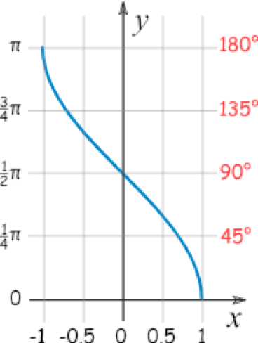
To understand this transformation, imagine the following: Varying values of the time-series swing along different angular positions, similar to a weather cock. The progression of time resembles the way rippling water waves would emanate from the point where a stone was dropped. The transformation equations (Equation 2a, 2b) form a bijection because \(\text{cos}\phi\) is monotonic when \(\phi \in{[0, \pi]}\) (see Figure 4.3). This means that, for a given time-series, the mapping in Equation 2 produces one and only one transformation in the polar coordinate system with a unique inverse function.
Next, we form the GAF matrix, \(G\) where each element is the cosine of the sum of each pair of \(\phi\)’s. This captures the temporal correlation within different time intervals:
\[ \Large G = \begin{bmatrix} \text{cos}(\phi_1+\phi_1) & \cdots & \text{cos}(\phi_1+\phi_m)\\ \text{cos}(\phi_2+\phi_1) & \cdots & \text{cos}(\phi_2+\phi_m)\\ \vdots & \ddots & \vdots \\ \text{cos}(\phi_m+\phi_1) & \cdots & \text{cos}(\phi_m+\phi_m) \end{bmatrix} \qquad\qquad(3) \]
4.1.3.3.1 Gramian Angular Summation Field (GASF)
In this form, we call the GAF matrix, \(G\), the Gramian Angular Summation Field (GASF):
\[ \Large G_{GASF} = \begin{bmatrix} \text{cos}(\phi_1+\phi_1) & \cdots & \text{cos}(\phi_1+\phi_m)\\ \text{cos}(\phi_2+\phi_1) & \cdots & \text{cos}(\phi_2+\phi_m)\\ \vdots & \ddots & \vdots \\ \text{cos}(\phi_m+\phi_1) & \cdots & \text{cos}(\phi_m+\phi_m) \end{bmatrix} \qquad(4) \]
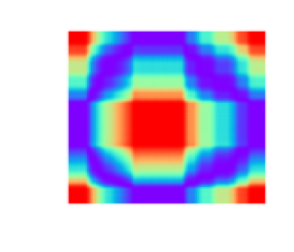
If the same time-series represented in Figure 4.1 is GASF-transformed, we get the image in Figure 4.4.
4.1.3.3.2 Gramian Angular Difference Field (GADF)
If the summations in the GAF matrix are replaced with differences, and the cosines with sinuses, we get the Gramian Angular Difference Field (GADF). To define the Gramian Angular Difference Field (GADF) we form the sine of the difference of each pair of \(\phi\)’s:
\[ \Large G_{GADF} = \begin{bmatrix} \text{sin}(\phi_1-\phi_1) & \cdots & \text{sin}(\phi_1-\phi_m)\\ \text{sin}(\phi_2-\phi_1) & \cdots & \text{sin}(\phi_2-\phi_m)\\ \vdots & \ddots & \vdots \\ \text{sin}(\phi_m-\phi_1) & \cdots & \text{sin}(\phi_m-\phi_m) \end{bmatrix} \qquad\qquad(5) \]
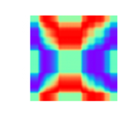
When Figure 4.1’s time series is GADF-transformed, we get the image in Figure 4.5.
4.1.3.4 Markov Transition Field (MTF)
The use of Markov Transition Fields is also described in Wang and Oates (2015a, 2015b, 2015c). Given a times-series \(X\), we identify its \(Q\) quantile bins by assigning each \(x^{<i>}\) to the corresponding bins \(q_j\) (\(j \in [1, Q]\)). This allows us to construct a weighted adjacency matrix \(W\) by counting transitions among quantile bins according to a first-order Markov chain along the time axis. The dimensions of \(W\) are \(Q \times Q\). Each element of \(W\), \(w_{ij}\), will be the frequency with which a point in quantile \(q_j\) is followed by a point in quantile \(q_i\).
Next, we normalize \(W\) by having \(\mathit\Sigma_j w_{ij}=1\). This gives us the Markov transition matrix. This matrix is insensitive to temporal dependency on the time steps \(t^{<i>}\). To compensate for the associated information loss (due to the lack of temporal dependency), we define the Markov Transition Field (MTF) in Equation 6:
\[ \Large M = \begin{bmatrix} w_{ij|x_1 \in q_i, x_1 \in q_j} & \cdots & w_{ij|x_1 \in q_i, x_m \in q_j} \\ w_{ij|x_2 \in q_i, x_1 \in q_j} & \cdots & w_{ij|x_2 \in q_i, x_m \in q_j} \\ \vdots & \ddots & \vdots \\ w_{ij|x_m \in q_i, x_1 \in q_j} & \cdots & w_{ij|x_m \in q_i, x_m \in q_j} \end{bmatrix} \qquad\qquad(6) \]
The matrix \(W\) (Markov transition matrix) is constructed as follows. The magnitude of all the datapoints are separated into \(Q\) quantile bins. The bins that contain the datapoints at timestamp \(i\) and \(j\) are \(q_i\) and \(q_j\). The associated transition probability of \(q_i \to q_j\) in \(M\) (Markov Transition Field) is \(M_{ij}\). This has the effect of spreading out the matrix \(W\) which contains the transition probability on the magnitude axis into the \(M\) matrix by taking into account the temporal positions. This leads to the \(M\) matrix actually encoding the multi-span transition probabilities of the time-series, because we assign the probability from the quantile at timestamp \(i\) to the quantile at timestamp \(j\) at each pixel \(M_{ij}\). The main diagonal \(M_{ii}\) contains the probability from each quantile to itself (also called the self-transition probability) at timestamp \(i\).
When the time series in Figure 4.1 is MTF-transformed, we get the image in Figure 4.6.
4.1.3.5 Recurrence Plot (RP)
Hatami, Gavet, and Debayle (2017) describe the recurrence plot transformation. Another source for this technique is Tripath and Acharya (2018).
A discussion of the recurrence plot (RP) relies on the concept of a phase space. Often used in the context of formal system theory, a phase space is a multidimensional space in which each axis corresponds to one of the variables necessary to specify the state of a system. Wikipedia offers the following definition:
In dynamical system theory, a phase space is a space in which all possible states of a system are represented, with each possible state corresponding to one unique point in the phase space. For mechanical systems, the phase space usually consists of all possible values of position and momentum variables. The concept of phase space was developed in the late 19th century by Ludwig Boltzmann, Henri Poincaré, and Josiah Willard Gibbs.
The recurrence of states is a typical phenomenon for dynamic non-linear systems. The time-series that are generated by these systems can be characterized by periodicities and irregular cyclic behavior which is a form of recurrent dynamics. A two-dimensional representation of such recurrence dynamics can be visualized, based on the exploration of an n-dimensional phase space trajectory. This visualization is provided by the recurrence plot (RP) transformation. Central to this approach is to show in which points trajectories return to a previous state. If \(K\) is the number of states \(\pmb{s}\), \(H\) is the Heaviside function, and \(\epsilon\) is a threshold distance, then the matrix \(R\) is given by Equation 7:
\[ \Large R_{ij} = H(\epsilon - \Vert \pmb{s}_i-\pmb{s}_j \Vert) \qquad\qquad\qquad(7) \]
where \(\pmb{s}\in \mathfrak{R}^n\) and \(i,j=1, 2, \ldots, K\). The \(\Vert .\Vert\) indicates the norm of the difference between the two state vectors.
To interpret the \(R\) matrix two aspects should be considered: Texture and typology. Texture manifests in the form of single dots, vertical lines, horizontal lines, and diagonal lines. Typology is encountered in the forms homogenous, periodic, disrupted, and drift. For example, if fading happens towards the upper left and lower right corners the dynamics exhibit a drift (commonly referred to as a trend). It is not always straightforward, however, to visually interpret a recurrence plot.
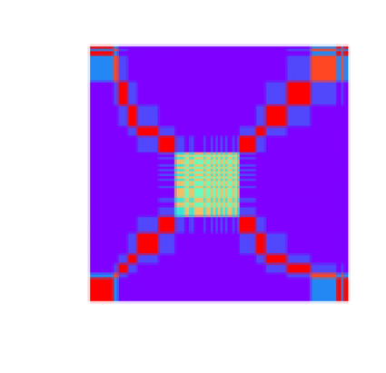
When the time series in Figure 4.1 is RP-transformed, we get the image in Figure 4.7.

4.1.4 Convolutional Neural Networks (CNNs)
The first paper that really showed the benefits of using CNNs for image classification was that of Krizhevsky, Sutskever, and Hinton (2012). A follow-up paper provided updates (Krizhevsky, Sutskever & Hinton, 2017). Convolutional Neural Networks are structured in a way that enables them to exploit translational invariance. They extract features through receptive fields. Significant weight sharing drastically reduces the number of parameters involved in training them. They are the state-of-the-art architecture in the handling of computer vision tasks.
A CNN consists of different types of layers. The most important ones are convolution, pooling, and dense layers. Convolution and pooling layers often alternate during the initial layers. Near the end, a number of dense layers usually occurs which often ends with a sigmoid or softmax layer in the case of a classification CNN.
4.1.4.1 Convolution layers
Convolution layers are described by the equations:
\[ \Large \begin{aligned} \mathbf{Z}^{[l]} &= \mathbf{W}^{[l]} \ast \mathbf{A}^{[l-1]} + \mathbf{b}^{[l]} \qquad(8) \\ \mathbf{A}^{[l]} &= g^{[l]}(\mathbf{Z}^{[l]}) \qquad\qquad\qquad\,(9) \end{aligned} \]
The filter (also called kernel) of a convolution layer is indicated by \(\mathbf{W}^{[l]}\) where \(l\) is the index of the layer. \(\mathbf{W}^{[l]}\) is tensor-valued with each element \(w_{ijk}^{[l]} \in \mathbb{R}\). The values of \(w_{ijk}^{[l]}\) are learned by the training process. The dimensions (or shape) of \(\mathbf{W}^{[l]}\) are \(n_C^{[l-1]} \times f^{[l]} \times f^{[l]}\) where \(n_C^{[l-1]}\) is the number of filters (also the number of channels) in the previous layer. The filter size is indicated by \(f^{[l]}\). If we have multiple filters in layer \(l\), the dimensions of \(\mathbf{W}^{[l]}\) expand to \(n_C^{[l]} \times n_C^{[l-1]} \times f^{[l]} \times f^{[l]}\) making \(\mathbf{W}^{[l]}\) a vector of tensors.
The activations in layer \(l\) are represented by another tensor \(\mathbf{A}^{[l]}\). For each layer, we distinguish between the input activations, \(\mathbf{A}^{[l-1]}\), and output activations, \(\mathbf{A}^{[l]}\). The dimensions of \(\mathbf{A}^{[l-1]}\) are \(n_C^{[l-1]} \times n_H^{[l-1]} \times n_W^{[l-1]}\) where \(n_C^{[l-1]}\) is the number of channels in the previous layer, \(n_H^{[l-1]}\) the height of the image in the previous layer, and \(n_W^{[l-1]}\) the width of the image in the previous layer.
The dimensions of \(\mathbf{A}^{[l]}\) are \(n_C^{[l]} \times n_H^{[l]} \times n_W^{[l]}\) where
\[ \Large n_H^{[l]}=\Bigg \lfloor \frac{n_H^{[l-1]}+2p^{[l]}-f^{[l]}}{s^{[l]}} + 1 \Bigg \rfloor\qquad\qquad\qquad\qquad(10) \]
\[ \Large n_W^{[l]}=\Bigg \lfloor \frac{n_W^{[l-1]}+2p^{[l]}-f^{[l]}}{s^{[l]}} + 1 \Bigg \rfloor\qquad\qquad\qquad\qquad(11) \]
The padding size in layer \(l\) is indicated by \(p^{[l]}\). The stride is represented by \(s^{[l]}\). If we make use of mini-batch training, the dimensions of \(\mathbf{A}^{[l]}\) will expand to \(n_C^{[l]} \times n_H^{[l]} \times n_W^{[l]}\) where \(m\) is the mini-batch size. In this case \(\mathbf{A}^{[l]}\) becomes a vector of tensors.
The bias vector in layer \(l\) is indicated by \(\mathbf{b}^{[l]}\). The convolution operation is indicated by the symbol \(\ast\). Equation 8 describes the linear part of the convolution. The activation part is captured by Equation 9. The activation function, \(g^{[l]}\), is often a rectified linear unit (ReLU).
Equations 8 and 9 can be combined into a single equation:
\[ \Large \mathbf{A}^{[l]} = g^{[l]}(\mathbf{W}^{[l]} \ast \mathbf{A}^{[l-1]} + \mathbf{b}^{[l]}) \qquad\qquad\qquad\qquad\,(12) \]
Piotr Skalski (2019) has a blog that makes the operation of CNNs easy to understand. It includes a number of animations that provide valuable insight.
4.1.4.2 Pooling layers
The filter of a pooling layer has no weights that need to be trained. It has a filter size \(f^{[l]}\), and a stride \(s^{[l]}\). The value for padding is almost always zero, \(p^{[l]}=0\). The filter performs an aggregation operation as it slides over the activation signal. This operation is performed on each of the input channels independently. Types of aggregation operations are maximum and average. The most common type is the max-pool layer. As the \(f \times f\) filter slides across the image, it picks the maximum activation for each position and sends that to the output image, thereby reducing the size of the input image according to equations (10) and (11). There is also no activation function. This means pooling layers are described by the following equation:
\[ \Large \mathbf{A}^{[l]}=\text{max}(\mathbf{A}^{[l-1]}) \qquad\qquad\qquad(13) \]
4.1.4.3 Dense layers
Dense layers always form the last few layers of a CNN that performs classification. These layers are also called fully connected layers. Dense layers are described by Equations 14 and 15:
\[ \Large \begin{aligned} \mathbf{z}^{[l]} &= \mathbf{W}^{[l]}\mathbf{a}^{[l-1]}+\mathbf{b}^{[l]}\qquad (14)\\ \mathbf{a}^{[l]} &= g^{[l]}(\mathbf{z}^{[l]})\qquad\qquad\qquad (15) \end{aligned} \]
Notice the absence of the convolution operator, which have been replaced by matrix multiplication.
The filter of a dense layer is indicated by \(\mathbf{W}^{[l]}\) where \(l\) is the index of the layer. \(\mathbf{W}^{[l]}\) is matrix-valued with each element \(w_{ij}^{[l]}\in\mathbb{R}\). The values of \(w_{ij}^{[l]}\) are learned by the training process. The dimensions of \(\mathbf{W}^{[l]}\) are \(n^{[l]} \times n^{[l-1]}\) where \(n^{[l-1]}\) is the number of input features (also the number of output features in the previous layer), and \(n^{[l]}\) is the number of output features.
The activations in layer \(l\) are represented by a vector \(\mathbf{a}^{[l]}\). For each layer, we distinguish between the input activations, \(\mathbf{a}^{[l-1]}\), and output activations, \(\mathbf{a}^{[l]}\). The dimension of \(\mathbf{a}^{[l-1]}\) is \(n^{[l-1]}\) where \(n^{[l-1]}\) is the number of neurons or hidden units in the previous layer. The dimension of \(\mathbf{a}^{[l]}\) is \(n^{[l]}\) where \(n^{[l]}\) is the number of units in the current layer.
There is no concept of padding nor of stride. The bias vector in layer \(l\) is indicated by \(\mathbf{b}^{[l]}\). Equation 14 describes the linear part of the filter. The activation part is captured by Equation 15. The activation function, \(g^{[l]}\), is often a ReLU.
As before, we can combine Equations 14 and 15 into a single equation (see Equation 16).
\[ \Large \mathbf{a}^{[l]} = g^{[l]}(\mathbf{W}^{[l]} \mathbf{a}^{[l-1]} + \mathbf{b}^{[l]}) \qquad\qquad\qquad\qquad\,(16) \]
If we make use of mini-batch training, the dimensions of \(\mathbf{a}^{[l]}\) will expand to \(n^{[l]} \times m\) where \(m\) is the mini-batch size. In this case \(\mathbf{a}^{[l]}\) becomes a matrix \(\mathbf{A}^{[l]}\) so that we have
\[ \Large \mathbf{A}^{[l]} = g^{[l]}(\mathbf{W}^{[l]} \mathbf{A}^{[l-1]} + \mathbf{b}^{[l]}) \qquad\qquad\qquad\qquad(17) \]
4.1.4.4 Residual Networks
He et al. (2016) provides an impressive and state-of-the-art architecture to improve the performance of CNNs even more. This architecture is called a residual network, or a ResNet. Sik-Ho Tsang (2018) has a blog that presents some of the details in a more digestible form.
A ResNet layer or block is developed as follows. As before, for a convolution layer, we have:
\[ \Large \begin{aligned} \mathbf{Z}^{[l]} &= \mathbf{W}^{[l]} \ast \mathbf{A}^{[l-1]} + \mathbf{b}^{[l]} \\ \mathbf{A}^{[l]} &= g^{[l]}(\mathbf{Z}^{[l]}) \end{aligned} \]
Let’s add 1 to the index values for the purpose of deriving:
\[ \Large \begin{aligned} \mathbf{Z}^{[l+1]} &= \mathbf{W}^{[l+1]} \ast \mathbf{A}^{[l]} + \mathbf{b}^{[l+1]} \qquad(18) \\ \mathbf{A}^{[l+1]} &= g^{[l+1]}(\mathbf{Z}^{[l+1]}) \qquad\qquad\qquad(19) \end{aligned} \]
The next layer will then be:
\[ \Large \begin{aligned} \mathbf{Z}^{[l+2]} &= \mathbf{W}^{[l+2]} \ast \mathbf{A}^{[l+1]} + \mathbf{b}^{[l+2]} \qquad(20) \\ \mathbf{A}^{[l+2]} &= g^{[l+2]}(\mathbf{Z}^{[l+2]}) \qquad\qquad\qquad(21) \end{aligned} \]
Now comes the crucial step. We feed the activations \(\mathbf{A}^{[l]}\) in Equation 18 forward by means of a skip-connection (also called a short-circuit-connection) and add them to \(\mathbf{Z}^{[l+2]}\) in Equation 20. This means Equation 21 now becomes:
\[ \Large \mathbf{A}^{[l+2]} = g^{[l+2]}(\mathbf{Z}^{[l+2]} + \mathbf{A}^{[l]}) \]
The ResNet block is therefore described by the equations:
\[ \Large \begin{aligned} \mathbf{Z}^{[l+2]} &= \mathbf{W}^{[l+2]} \ast \mathbf{A}^{[l+1]} + \mathbf{b}^{[l+2]} \qquad(22) \\ \mathbf{A}^{[l+2]} &= g^{[l+2]}(\mathbf{Z}^{[l+2]} + \mathbf{A}^{[l]}) \qquad\qquad(23) \end{aligned} \]
Expressed as a single equation we have:
\[ \Large \mathbf{A}^{[l+2]} = g^{[l+2]}(\mathbf{W}^{[l+2]} \ast \mathbf{A}^{[l+1]} + \mathbf{b}^{[l+2]} + \mathbf{A}^{[l]})\quad(24) \]
Adjusting the indexes again, we have
\[ \Large \mathbf{A}^{[l]} = g^{[l]}(\mathbf{W}^{[l]} \ast \mathbf{A}^{[l-1]} + \mathbf{b}^{[l]} + \mathbf{A}^{[l-2]})\qquad(25) \]
The ResNet architecture allows for much deeper networks than before by stacking ResNet blocks as deep as needed. In theory, as the number of layers in a traditional deep neural network increases, the training error should keep on decreasing. The reality is that when the network gets too deep, the training error actually starts to increase again. ResNets rescue this situation, allowing the training error to keep on falling even with the number of layers approaching one thousand.
Next we will discuss all the classification models used in this paper. All of them make use of a 50-layer ResNet architecture.
4.2 CLASSIFICATION MODELS
The purpose of the analytics pipeline is to separate useful (called typical) flight paths from non-useful (called non-typical/anomalous) ones. As pointed out earlier, a typical flight profile, in this context, means it is conducive to certain types of analyses. The main requirements for usefulness is that the flight profile will be fully developed, and have a canonical and extended cruise segment (see Figure 1.1). All other flight paths will be considered less useful/non-useful/anomalous for our purposes. Non-usefulness is often due to insignificant (i.e. too short) cruise segments and missing data (see Figure 1.2). Note that in visualizations and in the code, typical (useful) profiles are labeled as typ, while non-typical (non-useful) profiles will be labeled as non.
We will need a number of classification models to arrive at the objectives described above. Each model will select the useful flight profiles from its input data and pass them on to the next model in the pipeline. The output from the last model will represent a useful dataset for post-flight analysis as described in this paper. The pipeline is defined as follows: * Stage III: Developed/Non-developed Model * Stage II: Canonicity of Segments Model * Stage I: Extended/Short Cruises Model
Note that we count down, starting from Stage III which processes the rawest data. Stage I is the final stage that provides the usable data for the analyst.
4.2.1 Stage III: Developed/Non-developed Model (mod3)
The input datapoints for this model are all the flight profile images that was prepared by the data preparation step. In the software, this model is called mod3. The purpose of the model is to binary-classify flight profiles into developed profiles (labeled typ) and non-developed profiles (labeled non). A developed profile is complete in that it contains a climb segment, a cruise segment (even if it approaches a duration of zero minutes), and a descent segment.
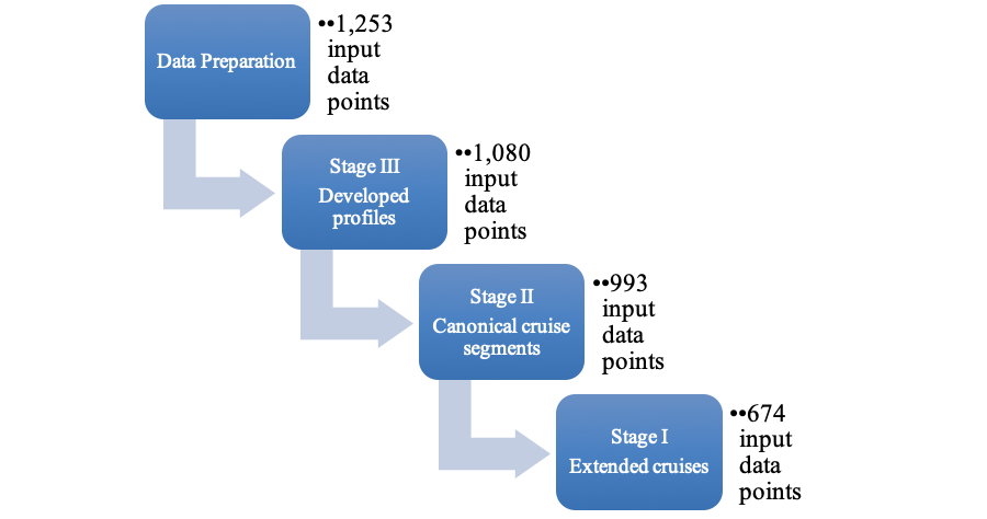
The Stage III model was chosen to investigate the performance of the range of transformation techniques described earlier. The main reason for this is that this stage has the most data available at its input (1,080 flight profiles, of which 993 are typical and 87 non-typical). This dataset was labeled by hand (using labels typ and non), and making use of the altitude line plots produced as described in section 4.1.3.1. On the filesystem, the .png files are in the following folders (Appendix A contains the complete filesystem layout): * dashlink * Train * png3 [‘3’ refers to mod3] * non [non-typical png files] * typ [typical png files]
There is a separate sub-model for each of the transformation techniques (mod3a, mod3b, mod3c, mod3d, mod3e, and mod3f). Each of the sub-models performs the same binary classification between developed and non-developed profiles. The only difference is in the way the input time-series was transformed into an image. Table 4‑1 provides a summary.
Table 4-1 Mapping between transformation technique and Stage III sub-model
| Transformation Technique | Stage III sub-model |
|---|---|
| Line plots | mod3a |
| Area plots | mod3f |
| Gramian Angular Summation Field (GASF) | mod3b |
| Gramian Angular Difference Field (GADF) | mod3c |
| Markov Transition Field (MTF) | mod3d |
| Recurrence Plot (RP) | mod3e |
The labeled training data for each sub-model appears in its own folder:
- dashlink
- Train
- png3a
- non
- typ
- png3b
- non
- typ
- png3c
- non
- typ
- png3d
- non
- typ
- png3f
- non
- typ
- png3a
- Train
The code for the sub-models are present in Python notebooks (click on a notebook to access the code):
Each sub-model’s notebook performs the following steps:
- Ingest data
- Form item list
- Form train and validation item lists
- Train list is 80% of data
- Validation list is 20% of data
- Form label lists
- All data is labeled based on the source file’s location in either the non, or the typ folder
- Transform data by resizing the images from 130x133 to 128x128
- Set batch size to 32
- Normalize data using the ImageNet statistics (for transfer learning)
- Train model
- Create a learner with the data and a ResNet-50 architecture
- Plot the Loss vs the Learning Rate that allows selection of the frozen learning rate by inspection
- Fit the learner’s model to the data using the frozen learning rate
- Plot the Train and Validation Loss vs the number of Batches
- Plot the metrics vs the number of Batches:
- f_beta
- precision
- recall
- error_rate
- accuracy
- Save the frozen model and iterate if necessary
- Unfreeze the model
- Plot the Loss vs the Learning Rate that allows selection of the unfrozen learning rate by inspection
- Fit the learner’s model to the data using the unfrozen learning rate and 10% of the frozen learning rate
- Plot the Train and Validation Loss vs the number of Batches
- Plot the metrics vs the number of Batches (as before)
- Save the unfrozen model and iterate if necessary
- Interpretation
- Plot the confusion matrix
- Calculate precision, recall, and F1_score
- Plot the top losses, i.e. data points that were predicted incorrectly
- Test Inference/Production (on train data)
- Export the trained, unfrozen model
- Pick a sample file from the “non” folder
- Shows this non-typical image for inspection
- Submit this image to the trained model to demonstrate that the output is the “non” category
4.2.1.1 Performance summary of sub-models
Five metrics are reported during training. Each of these is potentially effective for performance comparisons. However, in a situation of skewed classes (also known as class imbalance), precision, recall, error_rate, and accuracy become less useful. As mentioned above, out of 1,080 flight profiles, 993 are typical and 87 non-typical. This is clearly a skewed situation.
There is also a tradeoff between precision and recall. Furthermore, it is simpler to have a single metric to base performance comparisons on. Fortunately, there is a metric that combines precision and recall in a sensible way: The \(F_1\) score (Wikipedia has a good write-up). The \(F_1\) score is a special case of the \(F_\beta\) score which is defined as:
\[ \Large F_\beta = (1+\beta^2)\cdot\frac{precision \cdot recall}{(\beta^2 \cdot precision) + recall} \]
where \(\beta\) indicates how many times more important the value of recall is relative to that of precision.
With \(\beta=1\) we have:
\[ \Large F_1 = (1+1^2)\cdot\frac{precision \cdot recall}{(1^2 \cdot precision) + recall} \]
Finally,
\[ \Large F_1 = 2\cdot\frac{precision \cdot recall}{precision + recall} \]
Next, we will look at the definitions of precision and recall. Table 4‑2 shows how a confusion matrix is constructed for binary classification.
Table 4‑2 Confusion Matrix
| Confusion Matrix | Predicted Negatives | Predicted Positives |
|---|---|---|
| Actual Negatives | True Negatives (TN) | False Positives (FP) |
| Actual Positives | False Negatives (FN) | True Positives (TP) |
Referring to Table 4-2, the definitions of precision and recall are,
\[ \Large precision = \frac{TP}{TP + FP} \]
\[ \Large recall = \frac{TP}{TP + FN} \]
\(F_1\) is also known as the balanced F-score or the harmonic mean of precision and recall. In each sub-model’s notebook, the confusion matrix is presented and below it the \(F_1\) score is calculated. Table 4‑3 provides a performance comparison based on the \(F_1\) scores:
Table 4‑3 Performance summary of sub-models
| Transformation Technique | Sub-model | \(F_1\) score |
|---|---|---|
| Line plots | mod3a | 1.000 |
| Area plots | mod3f | 1.000 |
| Gramian Angular Summation Field (GASF) | mod3b | 0.983 |
| Gramian Angular Difference Field (GADF) | mod3c | 0.983 |
| Markov Transition Field (MTF) | mod3d | 0.964 |
| Recurrence Plot (RP) | mod3e | 0.957 |
4.2.1.2 Selection of sub-model with best transformation technique
It is somewhat surprising that the simplest transformations, line and area plots, provide the highest scores. It could be a situation where the more elaborate transformations are an “overkill” for the task at hand. At the same time, it is encouraging to see that a simpler transformation technique works better for the present task. But what if we over-fitted the line plot sub-model? Figure 4.8 shows the losses for the unfrozen sub-model and there is no reason to suspect an over-fit. It is also encouraging to receive a perfect score (in the case of line and area plots) which means that all 216 profiles have been classified correctly.
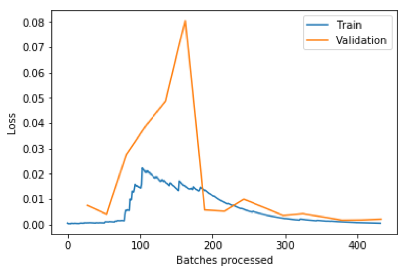
Thanks to the use of transfer learning, the small training time was also impressive. From the notebook, we see that, for the selected learning rate, the total training time for the frozen model was only seconds. The frozen model only trains the last few layers that provide customization for our purposes. For the unfrozen model the time was a mere seconds! The unfrozen model trains the complete architecture, for fine-tuning, making use of the transferred weights from the ImageNet model. In fact, it took much longer to experimentally find a good learning rate.
For the rest of the analytics pipeline we will only use the line plot transformation (the simpler transformation of the two that tied for the top score). This transformation has another advantage compared to the sophisticated techniques – it is easy to visually assess classification results. It will not be necessary to de-transform final results to visually inspect them.
4.2.2 Anomaly Detection Model (mod4)
In a situation of significant class imbalance, it is natural to use an anomaly detection algorithm. In the area of deep learning a method that is often used is the autoencoder. An autoencoder neural network is an unsupervised learning algorithm in which the target values are set to be equal to the inputs. This means that \(\mathbf{y}^{(i)}=\mathbf{x}^{(i)}\). The neural network consequently learns to reproduce its own input. This arrangement can be exploited by training it only on normal examples. When, after training, an anomalous example is submitted, the mean square error (MSE), also called the reconstruction error, is detectably higher. This higher MSE can then be used to flag anomalous datapoints. The Stanford article “Autoencoders” provides a thorough introduction.
In the previous section, we selected the line plot associated sub-model (mod3a) as the best. It will, however, be interesting to see how the performance of an autoencoder compares to that of the selected model, given the current situation of class imbalance. On the filesystem, the relevant .png files are in the folder:
- dashlink
- Train
- png4a [‘4’ refers to mod4]
- non [non-typical/anonymous png files]
- typ [typical/normal png files]
- png4a [‘4’ refers to mod4]
- Train
The code for the anomaly detection model, mod4, is present in the Python notebook:
Figure 4.9, Figure 4.10, and Figure 4.11 shows reconstruction efforts by the trained model from train, validation, and anomalous data, respectively (it was found that the autoencoder worked better when working with inverted images). It is clear that the reconstruction error is significantly higher in the case of the anomalous data (Figure 4.11).


The \(F_1\) score for this model (from the notebook) is 0.944. Table 4‑3 reveals that the autoencoder performs worse than all the classification sub-models in the previous section. Consequently, we will still use mod3a (as selected previously) for Stage III rather than the anomaly detection model (mod4).
4.2.3 Stage II: Canonicity of Segments Model (mod2)
The input for this model (993 data points) are all the useful profile images (from typ) that was output from the Stage III model (i.e. mod3a). In the software, this model is called mod2. The purpose of the model is to multi-label-classify developed profiles according to the canonicity of their segments. A segment (climb/cruise/descent) is considered canonical if it is relatively smooth, i.e. does not contain steps or other vertical irregularities. Table 4‑4 shows a fragment from the canonical-segments.csv file required by this model for training. Each of the 993 images were inspected and the canonicities of its segments were captured in the file under the tags column. Table 4‑5 shows the encodings used.
Table 4‑4 Fragment from canonical-segments.csv
| image_name | tags |
|---|---|
| 687200104111158-1min | cl cr |
| 687200104111441-1min | cl cr |
| 687200104120604-1min | cr |
| 687200104121330-1min | cl cr |
| 687200104130953-1min | cr |
| 687200104131343-1min | cl cr |
| 687200104131515-1min | cl cr |
| 687200104111637-1min | cl |
| 687200104120347-1min | cr |
| 687200104140606-1min | cl cr de |
| 687200104190709-1min | no |
| 687200104130631-1min | cl cr |
Table 4‑5 Codes used for canonicity of segments
| Encoding | Meaning |
|---|---|
| cl | canonical climb |
| cr | canonical cruise |
| de | canonical descent |
| no | no canonical segments |
This arrangement is flexible for analysts with more general needs. For example, say an analyst wants to use profiles with only smooth climb segments, or say non-smooth cruises and smooth descents, whatever the need, it is easy to tweak the notebook to output the required files.
On the filesystem, the .png files are in a single folder:
- dashlink
- Train
- png2 [contains all the png files]
- canonical-segments.csv file
- Train
The code for the Stage II model is present in the Python notebook:
The model’s notebook performs similar steps to what was described in Stage III. The main difference is due to training that supports multi-label classification rather than binary classification.
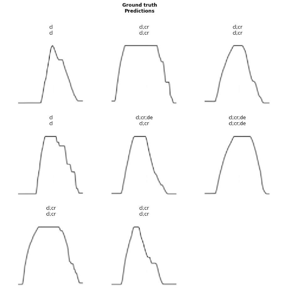
Figure 4.12 shows some examples of multi-label classification from the notebook.
The best \(F_1\) score that could be obtained for mod2 during training is 0.937 (compare with Table 4‑3). This is much lower than the score for mod3a (1.000). Firstly, it was trained on fewer data points (Figure 5.1). Secondly, the labeling process introduced some noise. It is somewhat subjective to decide whether, for example, a discontinuity towards the end of the cruise segment is associated with cruise itself, or, alternatively, with the beginning of descent. The model finds the classification task a bit more challenging due to this noise.
4.2.4 Stage I: Extended/Short Cruises Model (mod1)
The input for this model (674 data points) are all the profiles that were output from the Stage II model (i.e. mod2). These are the images of all profiles that have canonical cruise segments, regardless of the canonicity of climb or descent segments. In the software, this model is called mod1. The purpose of the model is to binary-classify between extended cruise segments (labeled typ) and segments with shorter cruises (labeled non). Each of the 674 images were inspected and manually placed in the appropriate folder (typ or non).
On the filesystem, the relevant .png files are in folders:
- dashlink
- Train
- png1 [‘1’ refers to mod1]
- non [short cruises]
- typ [extended cruises]
- png1 [‘1’ refers to mod1]
- Train
The code for the Stage I model is present in the Python notebook:
The model’s notebook performs the same steps as was described in Stage III.
The best \(F_1\) score that could be obtained for mod1 during training is 0.947 (compare with Table 4‑3). The current model was trained on even fewer data points (Figure 5.1). In spite of that an encouraging 0.947 \(F_1\) score was obtained. The labeling process again introduced some noise. It is not easy to always label the images accurately enough by making use of a purely visual inspection process. The discriminating decision is based on whether a cruise segment is extended or shorter. This is a subjective decision and an image regression algorithm would have been more suitable. Labeling would have been much more laborious if regression was used, however. It would have required a visual measurement (maybe by using an electronic ruler) of the length of the cruise segment (say to the nearest millimeter on an image) to use for the label. The model finds the classification task more challenging due to this noise.
This brings us to the end of the modeling section. We looked at the concept of time-series classification and the two major deep learning architectures used for this. Convolutional neural networks were identified as the superior architecture. To make use of CNNs, and to tap into the power of visual methods, we looked at a number of transformation techniques. The selected technique was a simple line plot of the time-series, giving us perfect classification performance on validation data. Finally, we covered the training processes of the analysis pipeline. It begins with Stage III (mod3a), then flows through Stage II (mod2), and ends with Stage I (mod1). In each stage the useful profiles are filtered out and passed on to the next stage.
5 INFERENCE
We have finally come to the application of the models developed above. During inference (also called testing in this paper) the trained models are presented with previously unseen data points. This is the situation in production when the developed models are called upon to provide value for users.
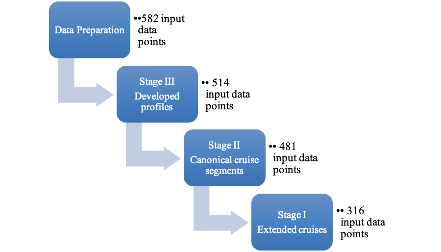
Figure 5.1 summarizes the analytics pipeline in the training mode. Compare this with Figure 5.2 which gives the same summary but in the testing or inference mode. The text in each box indicates the useful profiles filtered out by that stage.
5.1 TEST DATASET
The dataset for testing/inference was prepared in the same way as the dataset for training. Note that the datapoints are not labeled for inference. The size of the raw dataset is 582 flights (Figure 5.2). After preparation, the datapoints reduced to 514. The same notebook was used to prepare the test dataset (with a few configuration adjustments). The notebook is:
5.2 END-TO-END INFERENCE PROCESS
No training happens during inference. Instead, the output of each filter is passed to the input of the next filter in the pipeline. The output of the final filter (Stage I with mod1) is a set of developed profiles that have extended canonical cruise segments, ideal for the analyses concerned with in this paper.
Each model behaves as a filter that lets through all the useful profiles for the particular stage. This means * Taking prepared raw data, mod3a lets through all profiles that have been developed * Taking mod3a’s output, mod2 lets through all profiles with canonical cruise segments * Taking mod2’s output, mod1 lets through all profiles with extended cruise segments
5.2.1 Stage III Filter (mod3a)
The initial filter (mod3a) was presented with 514 test data points from the folder: * dashlink * Test * png3 [contains all the png files]
The code for the Stage III filter is present in Python notebook:
It is interesting to scroll through the two listings towards the end of the notebook. The first one shows the images for all the useful profiles, the second one shows the same for all the non-useful profiles. These lists of images give an idea of the classification performance.
5.2.2 Stage II Filter (mod2)
The second filter (mod2) was presented with 481 test data points from the folder: * dashlink * Test * png2 [contains all the png files]
The code for the Stage II filter is present in Python notebook:
Once again, the useful/non-useful profiles may be inspected.
5.2.3 Stage I Filter (mod1)
The final filter (mod1) was presented with 316 test data points from the folder: * dashlink * Test * png1 [contains all the png files]
The code for the Stage I filter is present in Python notebook:
Again, the useful/non-useful profiles may be inspected. This being the final results of the complete analytics pipeline, we see that the output consists of 26 useful profiles. They are all developed and have canonical and extended cruise segments, as we set out to find. There were 290 non-useful, or less useful, profiles in the final stage. It is immediately obvious how much time might be saved by using the analytics pipeline rather than having to inspect all 582 raw profiles manually to arrive at the 26 useful ones. There will be, no doubt, some miss-classifications too. This is unavoidable as the error rate of each stage contributes towards the pipeline’s overall error rate.
In this section, we looked at how the analytics pipeline developed in this paper might be used in a production setting to provide value for analysts. A test dataset was prepared. None of its data has ever been seen by any of the models during training. This is the normal situation in a production system. By looking at the classification results (in the form of images) from the notebooks, it is interesting to see to what extent the use of this pipeline might be helpful for analysts.
6 CONCLUSIONS & RECOMMENDATIONS
We have demonstrated how flight profile time-series can be turned into images for more effective classification. Then we identified the best technique to transform a profile time-series into an image for use by the classification process. Using transfer learning, we showed how quickly a deep learning model could be trained. We conclude that the need for hand classification of flight profiles has been reduced greatly leading to significant time savings potential for post-flight analysts. Making use of a publicly available rich flight data set we hope this work will encourage ordinary data scientists (which do not have access to company flight data) as well as post-flight analysts (that do have access) to undertake studies in this important area.
We recommend that interested analysts take this work as a starting point and adapt it to suit their needs. This may even involve changing the technology stack, for example, making use of other deep learning libraries and a different programming language. Here we used the fastai Python library (built on top of PyTorch) and the Python language. There are a number of other useful technology environments, e.g. Java, TensorFlow, Julia, and MATLAB.
We suggest that analysts need not shy away from the use of deep learning for post-flight analysis. The use of transfer learning makes the training of deep learning models very tractable. In our case, transfer learning was based on the ImageNet model which was trained on over 14 million images to classify them into more than 20,000 categories. There are many cloud providers offering the use of GPUs (Graphical Processing Units), ideal for the training process. GPUs are not necessary for inference. Even without access to a GPU, the training process is still tractable on an ordinary laptop. This is the beauty of transfer learning.
7 SUMMARY
In this work, we: * Performed a comparison of a number of transformation techniques in terms of their associated image classification performance. We applied each transformation technique to the cleaned time-series dataset in turn, trained a CNN to do classification (using supervised learning), and recorded the performance. Then we selected the most performant transformation technique and used it in the rest of the analysis pipeline. The following transformation techniques were considered: * Altitude line plots transformed into an image * Altitude area plots transformed into an image * Gramian Angular Summation Field (GASF) * Gramian Angular Difference Field (GADF) * Markov Transition Field (MTF) * Recurrence Plot (RP) * Trained a model to classify flight profiles into developed (useful) and non-developed (non-useful) profiles. We also considered the use of anomaly detection by means of an autoencoder (instead of a classification algorithm) due to the significant class imbalance and concluded that the autoencoder did not work as well as the classifier. * Trained a model to do multi-label classification of developed profiles. The labels reflected whether a profile had a canonical climb/cruise/descent segment. * Trained a model to classify flight profiles with canonical cruise segments (regardless of the properties of climb or descent segments) into profiles that have extended cruises (useful) and shorter cruises (non-useful). * Prepared a significant test dataset, consisting of datapoints that have never been seen by any of the models and have not been labeled. We constructed an end-to-end analytic inference process to simulate a production system and applied it to the test dataset. Finally, we made recommendations to post-flight and other interested analysts.
8 FURTHER EXPERIMENTATION
There are a good number of hyper-parameters that may be adjusted leading to further experiments, for example: * Fraction of train data dedicated for validation (20% here) * The batch size during training (32 for mod3a and 8 for mod2 and mod1) * Images were resized to 128 x 128. A technique that holds promise is to first down-sample images drastically, say to 32 x 32. Then, after training, transfer learning is used while progressively up-sampling again. * Learning rates. This is arguably the most influential hyper-parameter during training. It may be worthwhile to adjust the used learning rates, (both for the frozen learning rate, lrf, as well as the unfrozen learning rate, lru.
We used data from a single airplane in this study. It may be worthwhile to analyze the datasets available and put together a dataset that represents a number of different aircraft. Care should be taken, however, because the identity and model of aircraft are deliberately omitted. This means the analyst might end up with data from a 747 being mixed with that of a Lear Jet, or even a Cessna, probably not all that useful.
No data augmentation was used during training. It should be possible to generate more data by flipping images horizontally for mod3a and mod1. This will not work for mod2 due to the implied change of the segment types. A small amount of zooming might also be tried.
The CNN architecture used throughout was ResNet-50. We believe ResNet is the current state-of-the-art but there are other promising architectures, i.e. the Inception network. If an experimenter is challenged in terms of compute-resources, the ResNet-50 can be scaled down, e.g. to ResNet-34 or ResNet-18.
In the case of the autoencoder, a linear autoencoder was used. Better results might be obtained if a convolutional autoencoder is used instead. The code for a convolutional autoencoder is included in the anomaly detection notebook.
Finally, we need to mention that, although this paper focused on only using the altitude time-series of a flight, there are many more variables to explore. As mentioned, our data source makes 186 variables available. A few simple explorations are undertaken in the Python notebook:
Something interesting that might be tried is to combine a number of normalized variables (to allow for a single vertical scale) on a single line plot, each in a different color. Deep learning may then be used to train for the identification of normal versus anomalous situations.
REFERENCES
Autoencoders. (n.d.). Retrieved September 28, 2019, from http://ufldl.stanford.edu/tutorial/unsupervised/Autoencoders/
Automatic dependent surveillance – broadcast. (n.d.). In Wikipedia. Retrieved September 19, 2019, from http://en.wikipedia.org/wiki/https://en.wikipedia.org/wiki/Automatic_dependent_surveillance_%E2%80%93_broadcast
Bagnall, A., Lines, J., Bostrom, A., Large, J., & Keogh, E. (2017). The great time series classification bake off: a review and experimental evaluation of recent algorithmic advances. Data Mining and Knowledge Discovery, 31(3), 606-660.
Bagnall, A., Lines, J., Hills, J., & Bostrom, A. (2016). Time-series classification with COTE: The collective of transformation-based ensembles. International Conference on Data Engineering, pp 1548-1549.
Culurciell, E. (2018). The fall of RNN / LSTM. [Weblog]. Retrieved from https://towardsdatascience.com/the-fall-of-rnn-lstm-2d1594c74ce0
Esling, P., & Agon, C. (2012). Time-series data mining. ACM Computing Surveys, 45(1), 12:1-12:34.
Fawaz, H. I., Forestier, G., Weber, J., Idoumghar, L., & Muller, P. (2019). Deep learning for time series classification: a review. Data Mining and Knowledge Discovery, 33, 917. https://doi.org/10.1007/s10618-019-00619-1
F1 score. (n.d.). In Wikipedia. Retrieved September 27, 2019, from https://en.wikipedia.org/wiki/F1_score
He, K., Zhang, X., Ren, S., & Sun, J. (2016). Deep Residual Learning for Image Recognition. IEEE Conference on Computer Vision and Pattern Recognition (CVPR), Las Vegas, NV, 2016, pp. 770-778. doi: 10.1109/CVPR.2016.90
Hatami, N., Gavet, Y., & Debayle, J. (2017). Classification of time-series images using deep convolutional neural networks. International Conference on Machine Vision.
Hüsken, M., & Stagge, P. (2003). Recurrent neural networks for time series classification. Neurocomputing, 50, 223-235. Retrieved from https://www.sciencedirect.com/science/article/pii/S0925231201007068?via=ihub
Karpathy, A. (2015). The Unreasonable Effectiveness of Recurrent Neural Networks. [Weblog]. Retrieved from http://karpathy.github.io/2015/05/21/rnn-effectiveness/
Krizhevsky, A., Sutskever, I., & Hinton, G. E. (2012). Imagenet classification with deep convolutional neural networks. In NIPS, 2012.
Krizhevsky, A., Sutskever, I., & Hinton, G. E. (2017). ImageNet classification with deep convolutional neural networks. Commun. ACM, 60(6), 84-90. DOI: https://doi.org/10.1145/3065386
Lines, J., Taylor, S., & Bagnall, A. (2016). HIVE-COTE: The hierarchical vote collective of transformation based ensembles for time series classification. IEEE International Conference on Data Mining, pp 1041-1046.
Lines, J., Taylor, S., & Bagnall, A. (2018). Time series classification with HIVE-COTE: The hierarchical vote collective of transformation-based ensembles. ACM Transactions on Knowledge Discovery from Data, 12(5), 52:1-52:35.
Rabinowitz, J. (2017). This Is How Flight Tracking Sites Work. Retrieved from https://thepointsguy.com/2017/09/how-flight-tracking-sites-work/
Skalski, P. (2019). Gentle Dive into Math Behind Convolutional Neural Networks. [Weblog]. Retrieved from https://towardsdatascience.com/gentle-dive-into-math-behind-convolutional-neural-networks-79a07dd44cf9
Sun, Z., Di, L. & Fang, H. (2019). Using long short-term memory recurrent neural network in land cover classification on Landsat and Cropland data layer time series. International Journal of Remote Sensing, 40(2), 593-614. DOI: 10.1080/01431161.2018.1516313. Retrieved from https://www.tandfonline.com/doi/abs/10.1080/01431161.2018.1516313
Tripathy, R. K., & Acharya, U. R. (2018). Use of features from RR-time series and EEG signals for automated classification of sleep stages in deep neural network framework. Biocybernetics and Biomedical Engineering, 38, 890-902.
Tsang, S. (2018). Review: ResNet — Winner of ILSVRC 2015 (Image Classification, Localization, Detection). [Weblog]. Retrieved from https://towardsdatascience.com/review-resnet-winner-of-ilsvrc-2015-image-classification-localization-detection-e39402bfa5d8
Wang, Z., Yan, W., & Oates, T. (2017). Time series classification from scratch with deep neural networks: A strong baseline. 2017 International Joint Conference on Neural Networks (IJCNN), 1578-1585.
Wang, Z., & Oates, T. (2015a). Encoding Time Series as Images for Visual Inspection and Classification Using Tiled Convolutional Neural Networks. Trajectory-Based Behavior Analytics: Papers from the 2015 AAAI Workshop. Retrieved from https://aaai.org/ocs/index.php/WS/AAAIW15/paper/viewFile/10179/10251
Wang, Z., & Oates, T. (2015b). Imaging time-series to improve classification and imputation. International Conference on Artificial Intelligence, pp 3939-3945.
Wang, Z., & Oates, T. (2015c). Spatially Encoding Temporal Correlations to Classify Temporal Data Using Convolutional Neural Networks. ArXiv, abs/1509.07481.
Xu, K., Ba, J., Kiros, R., Cho, K., Courville, A., Salakhudinov, R., … Bengio, Y. (2015). Show, Attend and Tell: Neural Image Caption Generation with Visual Attention. Proceedings of the 32nd International Conference on Machine Learning, in PMLR, 37, 2048-2057.
Yang, Q., Wu, X. (2006). 10 challenging problems in data mining research. Information Technology & Decision Making, 05(04), 597-604.
APPENDICES
Appendix A: Filesystem Layout
- dashlink
- Train
- 1min
- .csv files
- png3
- non
- typ
- png3a
- non
- typ
- export.pkl file
- png3b
- non
- typ
- export.pkl file
- png3c
- non
- typ
- export.pkl file
- png3d
- non
- typ
- export.pkl file
- png3e
- non
- typ
- export.pkl file
- png3f
- non
- typ
- export.pkl file
- png2
- .png files
- canonical-segments.csv file
- export.pkl file
- png1
- non
- typ
- export.pkl file
- 1min
- Test
- png3
- non
- typ
- src3
- .png files
- png2
- non
- typ
- png1
- non
- typ
- png3
- 10_mat2csv.ipynb
- 10_mat2csv-2.ipynb
- 10_csv2png-3.ipynb
- 20_eda1.ipynb
- 30_mod3a.ipynb
- 30_mod3b.ipynb
- 30_mod3c.ipynb
- 30_mod3d.ipynb
- 30_mod3e.ipynb
- 30_mod3f.ipynb
- 30_mod4-2.ipynb
- 30_mod2.ipynb
- 30_mod1.ipynb
- 40_inf3.ipynb
- 40_inf2.ipynb
- 40_inf1.ipynb
- Train
NOTE: The Python notebook files (.ipynb) have a prefix that indicates the following: * 10_ for data preparation * 20_ for exploratory data analysis * 30_ for modeling and training * 40_ for inference and testing
