Purpose
This project involves the critique of the format and contents of the annual report of a non-profit. The annual report is about the operations of an initiative known as MissionTran. The need that the client has is to evaluate the current structure and contents of the annual report in the light of best-practice data communication standards, as well as obtain recommendations to improve the data communication aspects of it. A copy of the annual report may be found here.
Description of the Data Product
The MissionTran project uses a team of volunteers to proofread machine-translated sermons into a number of languages. Users proofread and correct machine-translated sentences one-by-one. Each proofreading effort to a sentence is called a contribution and comes in the form of an edit.
There are two kinds of contributions: Votes and Creates. A vote contribution happens when the user decides to simply vote for the provided translation, i.e. the user deems the translation to be correct. A create contribution happens when the user edits the translation to correct it.
There are a number of bases upon which a contribution is made. For vote contributions, the bases are: - By accepting the machine-translated sentence as is (‘a’) - By creating a new edit (‘c’) - By topping, i.e. by voting for the current edit with the most votes (‘t’) - By picking another edit to vote for (‘p’)
For create contributions the bases are: - By clearing (‘k’) - By modifying (‘m’)
A number of metrics are collected by the system: - time used to make a vote contribution - time used to make a create contribution - vote time spent to proofread a complete translation (assignment) - create time spent to proofread a complete translation (assignment)
The components of the system may be summarized as follows: - a Translation has many - Sentences has many - Edits has many - Contributions - a Translation has many - Assignments has many - Contributions - A User has many - Assignments
Finding Your Purpose and Message
Actionable data
The location of actionable data in the annual report is not straightforward. Most charts seem to simply dump data. Only some charts seem to suggest its use as a trigger for action. One such chart is the report’s Figure 12 which shows the number of contributions by username by contribution kind:
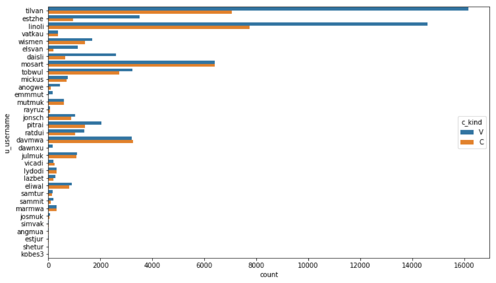
This chart shows how productive users were by showing the total number of contributions each made. This number is further broken down into vote contribution and create contributions.
Balance
There should be a balance between the representations for the data, the author, and the audience. In the report, the balance is tilted strongly in the direction of the data. There is a strong impression that all available data has simply been dropped into the document. The consumer is then expected to pick out pieces for consumption.
The document does not reveal much about the objectives of the author, except maybe to communicate the progress of the translation team.
There is an implication that the audience’s need is simply to know the progress of the project.
Audience factors
The role of the audience seems to be stakeholders interested in the status of the project. There is hardly any structure that would make it easy and direct to answer high-priority questions.
The workflow of the audience might be catered for as the information is presented in the form of charts that can be accessed easily in an office setting.
There is no elaboration on the data comfort and skills of the audience. The author does point out that “The workings of the translation system will not be presented here as most stakeholders are well aware of the details.” This suggests that the audience possess the industry and data expertise and does not need embedded explanations.
Information Discrimination
There is no identifiable core problem/theme. The report is simply a series of charts that try to convey the performance of the team. There is not a good separation of reporting from exploration. Some charts, like Figure 10, are totally unnecessary. This chart should have at least been pushed to an appendix but there is no appendix. Here is Figure 10:
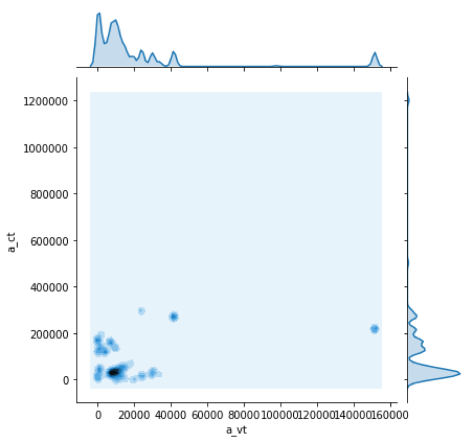
Figure 10 seems much too technical and does not belong with the remaining charts.
There is a section (at the end) on “Day of Week.” The chart in this section (Figure 13), breaks down contribution effort (in seconds) by day-of-week by contribution kind:
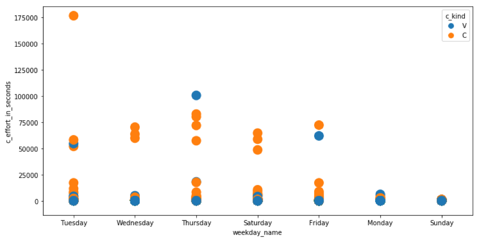
It seems unnatural to do this kind of breakdown. Why would distribution of effort per contribution vary with day of week. I cannot think of a fundamental reason why a user’s need for time to proofread a specific sentence would vary by day-of-week. This is not a meaningful chart. It should be thrown out.
With a stretch of imagination one could think of the following scenario. Let us say on Mondays, there are always a series of celebrations in the large conference room next door. This might be distracting to the proofreaders. This kind of scenario, however, should be investigated in the ‘backroom’. It should not be part of regular annual report.
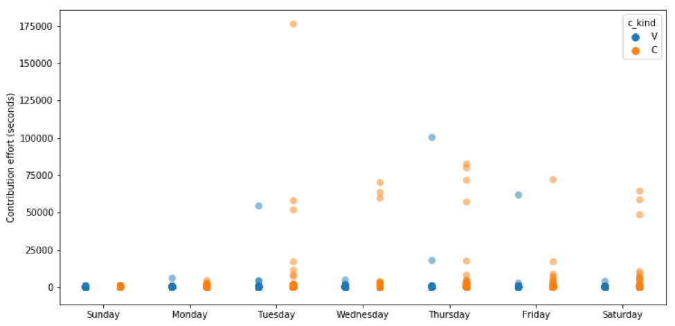
If the author happens to insist on keeping this chart, it should be changed considerably. Its current form hardly shows the required information. The presence of a few outliers compresses the real data so much that nothing is revealed. Here is a first suggestion. The weekdays are ordered, the axis labels are improved, and a measure of transparency is given to the markers. This helps to show how much overlap of points there are:
Even better, we can provide a small amount of sideways random jitter to help reveal the overlap:
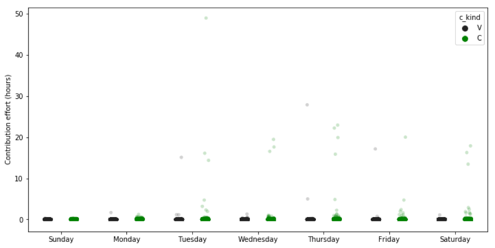
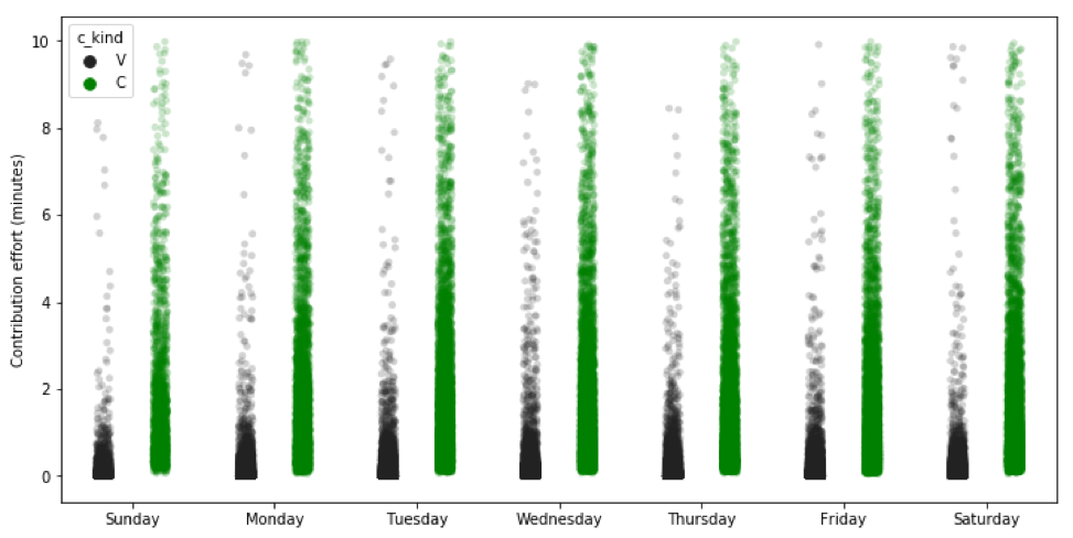
If we remove the outliers, the chart becomes more effective:
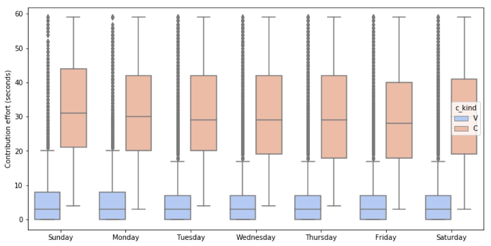
We may also use a boxplot which is commonly used in a case like this:
A violin plot will also be effective:
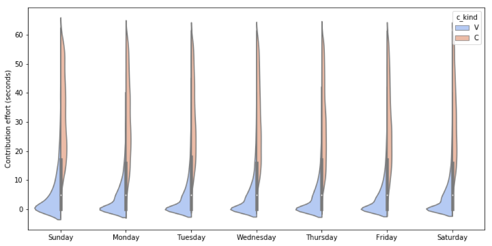
The latest plots all reveal that there is no real variation in contribution effort per sentence over day-of-week. This was certainly not evident from the original chart.
Defining Meaningful and Actionable Metrics
The area of metrics is the strong point of the document. Metrics are: - not too simplistic - not overly complex - not too many - none are vanity metrics
The metrics have a common interpretation, e.g. - time used to make a vote contribution - time used to make a create contribution - vote time spent to proofread a complete translation (assignment) - create time spent to proofread a complete translation (assignment) - total vote time spent during an assignment.
Metrics are mostly actionable; e.g. how much time is spent per sentence.
Metrics are accessible and also transparent with simple calculations.
Creating Structure and Flow to your Data Products
There is a simplistic logical structure and no narrative at all – very poor!
The author could have chosen one of many narrative flows, e.g. to - show how machine-translated assisted proofreading is more efficient than humans translating from scratch - show how the productivity of users varies by language - show the work patterns of users, i.e. a steady amount each workday, or only on one day per week, etc.
There is no meaningful flow however. There is no notion of the “guided safari” storytelling, or even of a traditional story. This is a glaring weakness in the data product.
Designing Attractive, Easy-to-understand Data Products
The presentation looks rough and unfinished (low aesthetic value). Given the author’s comment about the stakeholders’ understanding of the workings of the system, this might be overlooked somewhat.
There is no need for connectivity, data detail, interactivity, and mobility as this is an annual report.
The use of color in charts was mostly acceptable.
The author often did not choose the most appropriate chart type, e.g. in Figures 1 and 2 a line chart should have been used instead of the heat maps:

If the author insists on having a heat map, it could have been made simpler and more effective:

The chart type for Figure 6 was chosen poorly and the presence of a few outliers hide most of the real data:
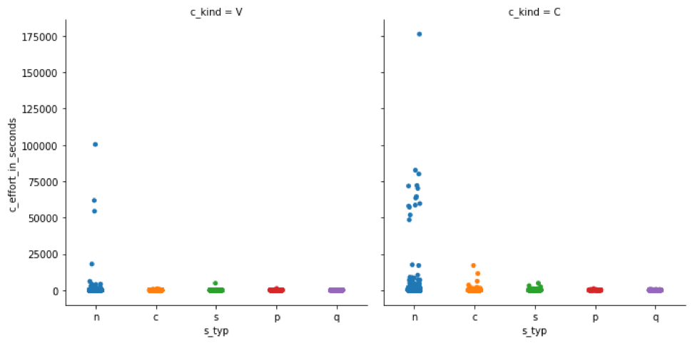
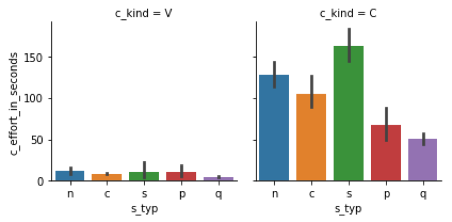
The following chart would have been more effective (after removing the outliers):
Creating Dialogue with Your Data Products
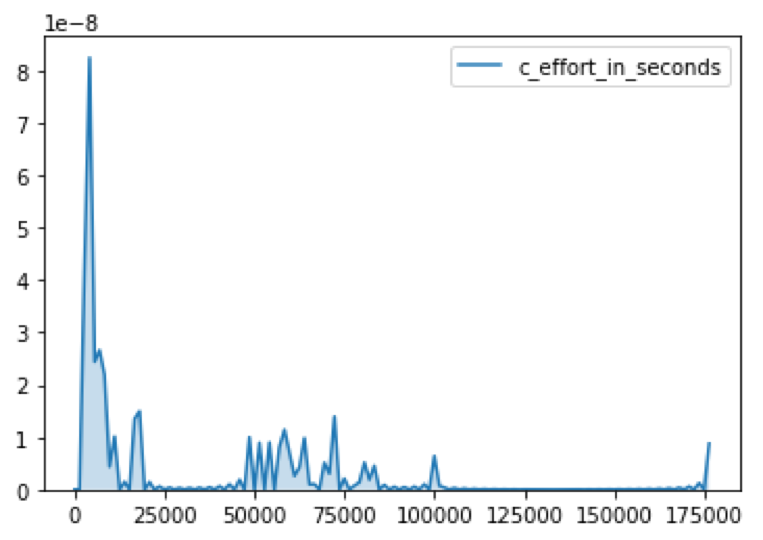
In general, there is not a lot of chart junk. The author mostly used sufficient contrast. Readability of labels are generally bad. A serious omission is that no chart has a heading! For example, Figure 11:
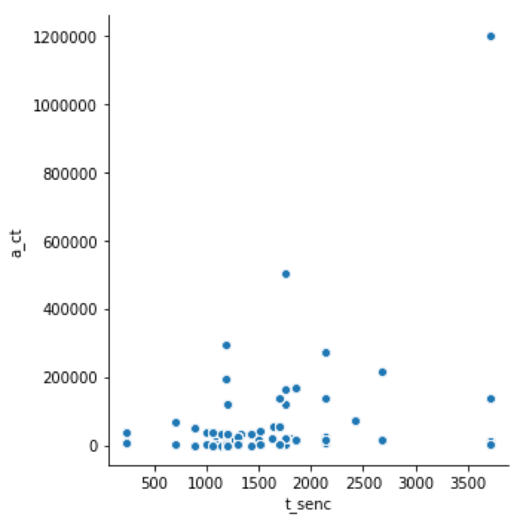
The time units are always in seconds which is often inappropriate. Although the meaning of variables is explained, it is bothersome that they appear in their “software” form on axes, as in Figure 8:
Sentence types are not defined anywhere.
Sorting for comprehension could have been done in Figure 5 and 12:
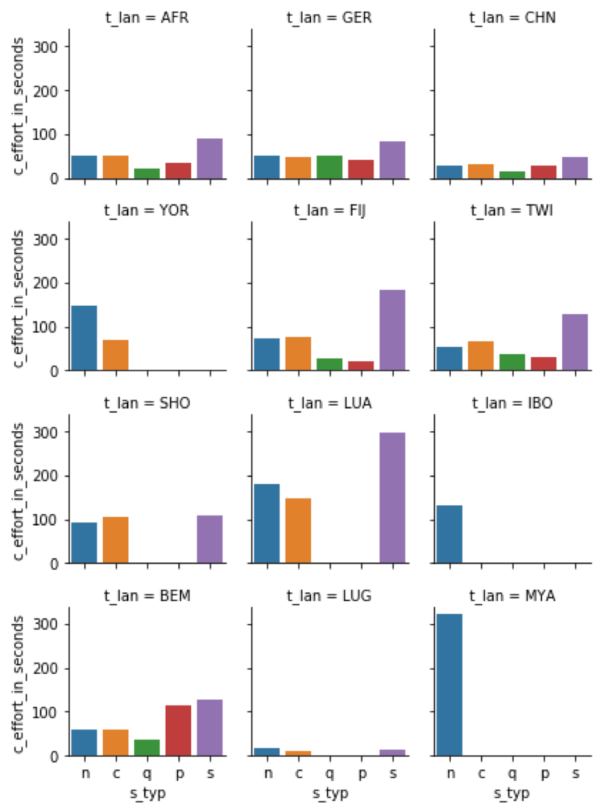

In addition, monotone color variants could have been used in Figure 12.
Summary
The annual report showcases a lot of data. The disappointing part is that it has been done ineffectively and unprofessionally.
The main weaknesses are: - No purpose or message - Use of data indiscriminately - Weak structure and no narrative flow - No mentionable design - Will not trigger conversation and dialogue in a straightforward way
The one strength: - Meaningful metrics
